Framehouse
A hiring platform for the independent film industry, where trust sits at the core of the product
The independent film industry hires on who you know. Work is agreed in direct messages, pay rests on somebody’s word, and the job leaves no record either party can point to afterwards, so people go unpaid and cannot prove what they have done. Framehouse replaces that with escrow, verified outcomes, and a permanent record of who worked with whom.
Long story short: I was the sole UX designer on the project. I asked what “earned” could mean on a platform where everyone is already verified, and the answer redefined the mechanic the whole product rested on.
The founder is a film director in Las Vegas who had watched the same thing happen for years. People with real ability and no contacts stayed invisible, and everyone else took work on trust and hoped to be paid. He came to me to build the alternative, and set one hard rule. The platform could not rely on the mechanics job boards normally use to manufacture activity. No urgency. No vanity metrics. No status anybody could buy.
The design covers the whole lifecycle: posting a role, hiring, escrow, delivery, disputes, and the verified credit that stays on both profiles afterwards. The wireframes were shown in the first investor conversations, and the company raised its first $50,000. The file went to the developer hired to build Framehouse.
Hiring in the independent film industry asks two strangers to trust each other on no evidence. A platform that puts a crew member and a job poster in touch goes no further than the introduction, and the risk of the arrangement stays with those two people.
The founder went to film school, spent eight years working in Hollywood, and now speaks at film schools himself. Every time he does, a student asks him where to go to find work on a set, and he has never had an answer he was happy to give.
“When you finish film school, there is no one directory website for you to look for jobs. Whoever you made friends with, those are how you’re gonna find jobs.”
Craigslist, IMDb and StaffMeUp are the three places people look, and each was built for a different purpose. Craigslist is a classifieds board, where a listing carries no check on who posted it. IMDb is the industry’s record of credits, and its subject is the finished film rather than the work someone is looking for next. StaffMeUp comes closest, listing crew roles for productions, and it stops at the introduction. None of the three holds the funds, so payment still moves directly between two people who have never worked together before.
Framehouse builds the missing parts into the product: both sides verified before anyone can post or apply to a job, payment held by the platform until both confirm the work happened, and a credit written to both profiles afterwards that neither can edit.
The brief set the constraints before any screen existed. Three of them shaped every decision that follows.
- Trust over engagement. No gamification, no urgency mechanics, no vanity metrics
- Pay is primary. No role can be posted without a pay figure
- Verification is structural. Not decorative
Those constraints remove the usual ways of making a marketplace feel busy. Countdown timers, badges and activity counters were all ruled out, so confidence had to come from what the platform does with a person’s money and record instead.
Dark patterns are the reason those constraints matter to me, and they are what my dissertation research tested: whether certain personality types are better at recognising manipulative interface design. They are not. If spotting manipulation does not depend on the person, a product cannot rely on the people using it to catch it. Protection has to be built into the structure instead.
Every decision on this product came back to the same question. Does this hold to the standard the platform sets, or does it only look as though it does?
The question that changed what a stone meant
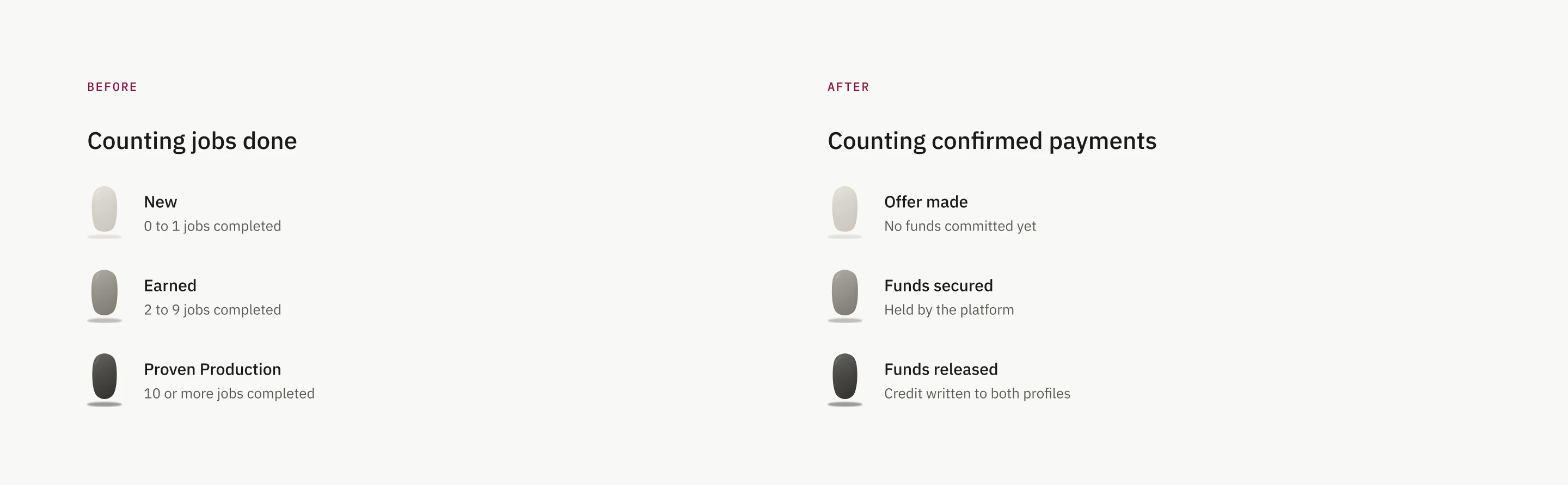
Initially, every profile carried a standing stone. The stone darkened as it was earned, and at first it counted completed jobs. The more the user worked, the darker the stone became.
That is where it came apart. Every user on Framehouse, job seeker and job poster, is verified before they can use the platform, which is the entire premise of the product. A stone that counts jobs done is therefore not measuring whether someone can be trusted. It measures how busy they have been, and rewarding busyness is gamification, which the first principle ruled out. The feature built to prove this platform was different was on its way to making it identical.
Which left one question. If everyone is already verified, what is there left to earn?
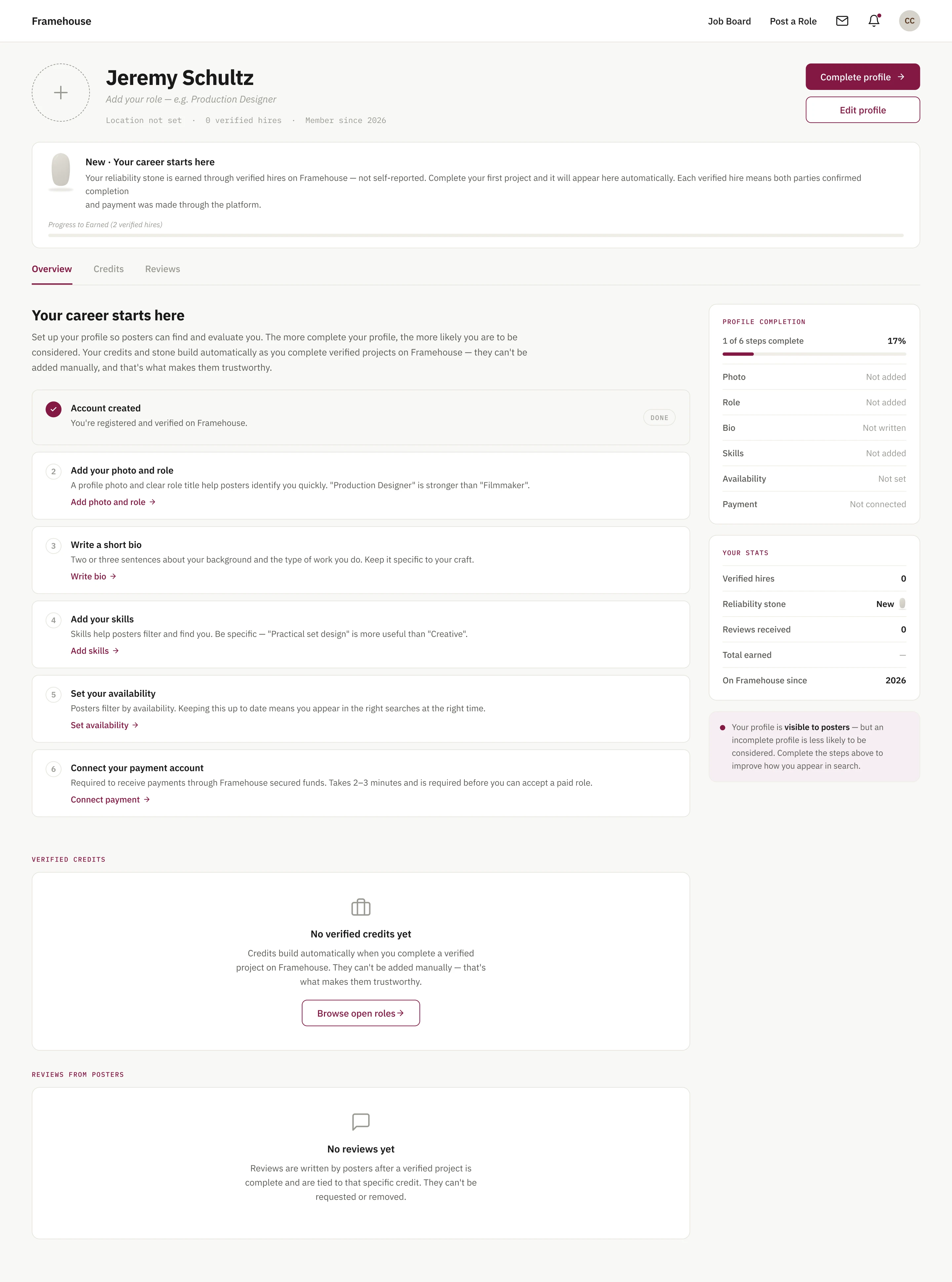
Trust is what is left, and the only evidence for it is a payment the platform has secured and released. Verification confirms that a person is real, and it stops there. A verified poster can still turn out to have no budget, and a verified crew member can still finish the job and never be paid. Those are the two failures this industry runs on, and identity predicts neither. A completed payment answers both at once, which is why it is the one thing a profile can claim that cannot be self-reported.
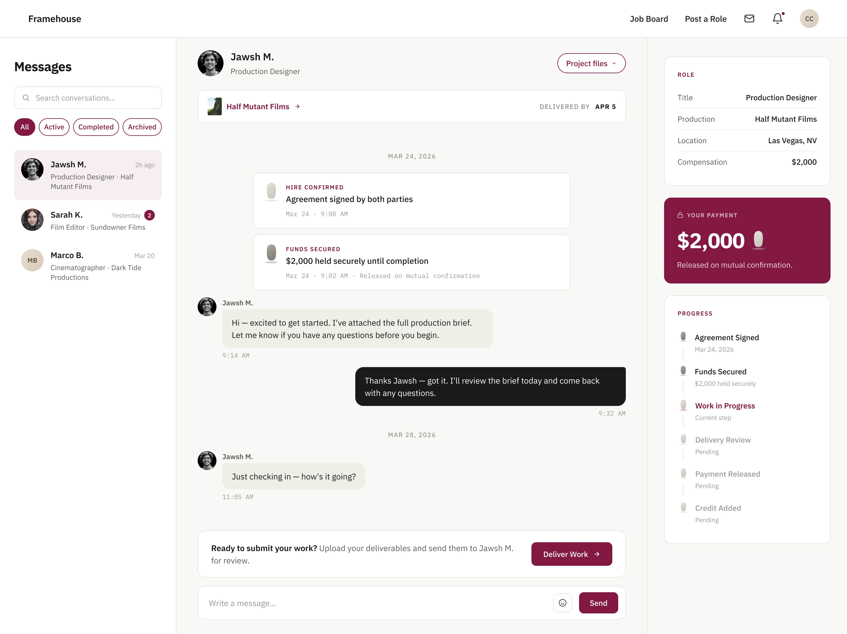
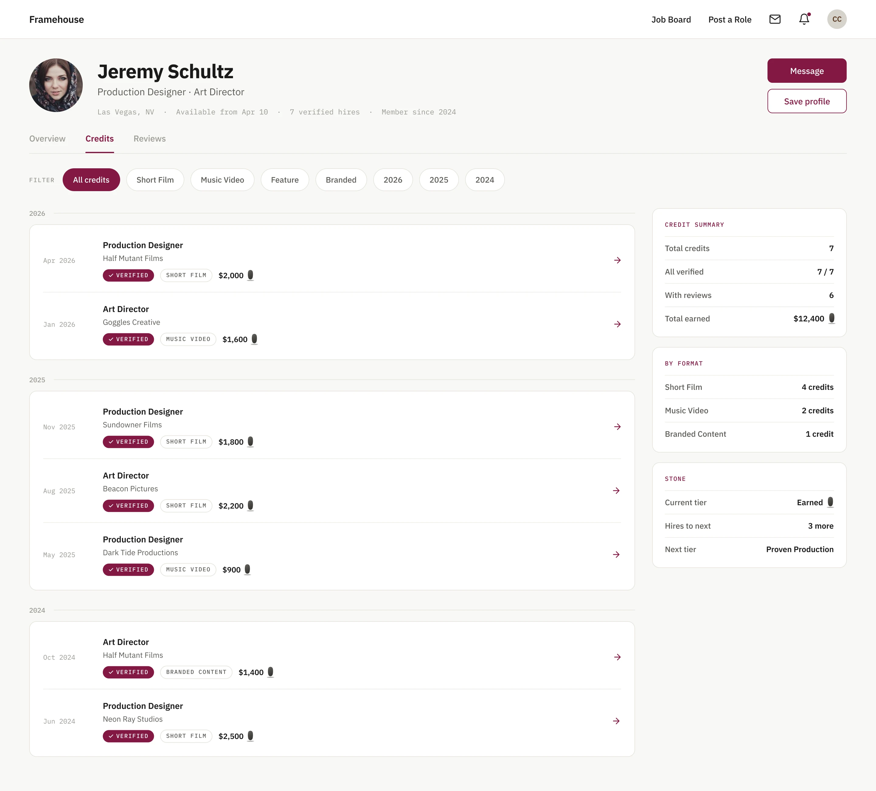
The stone was rebuilt around that. It stopped counting activity and started counting secured payments. Inside a project it tracks the funds: the lightest state is an offer with nothing committed, the grey state means funds are held by the platform, and the black state means funds have been released and the job sits permanently on both records.
On a profile the three tiers kept their names, and the unit beneath them changed. A tier now counts hires the platform has paid out, so reaching one means the money moved, rather than that somebody says the work happened.
Saying where you are without saying it four times
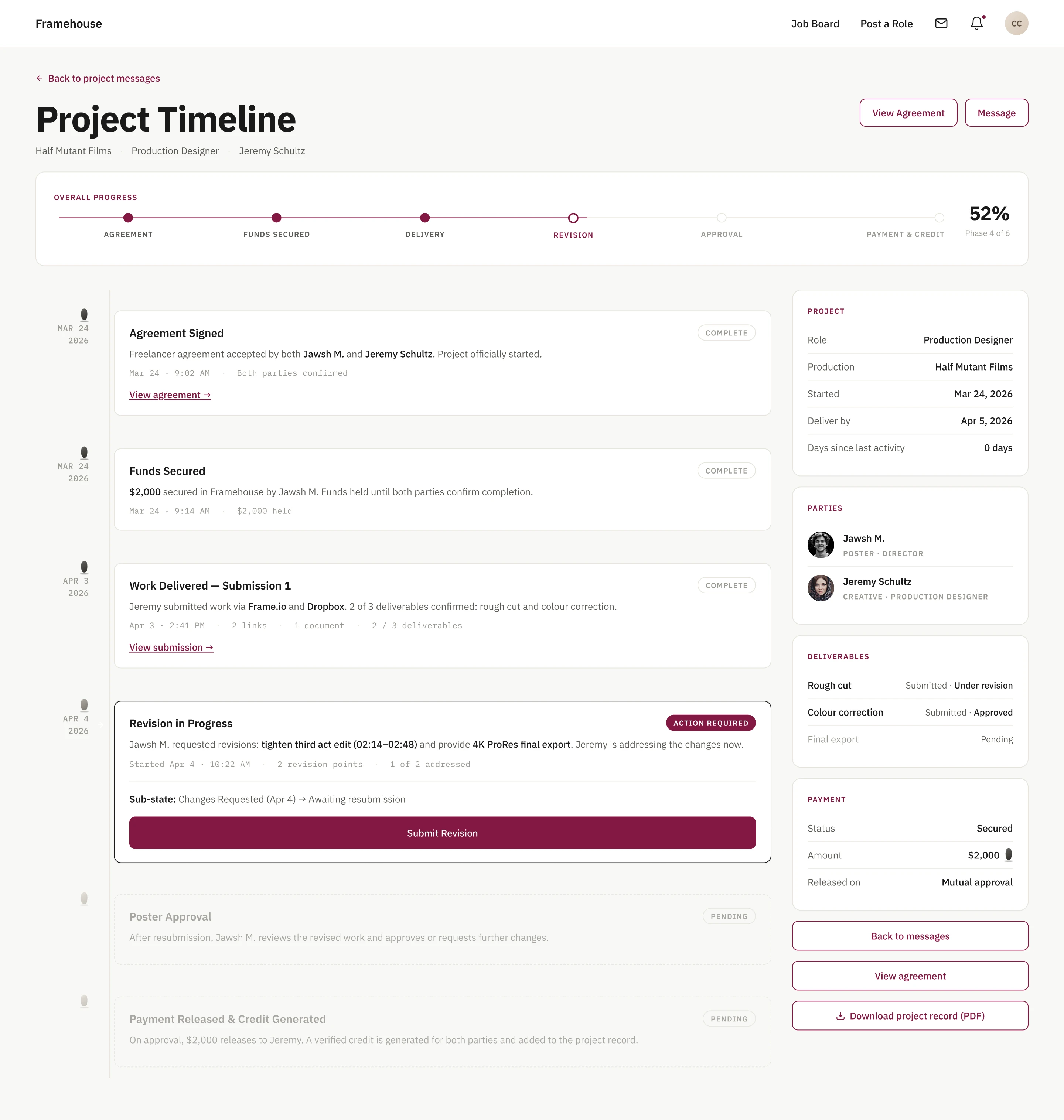
Four elements were reporting progress at once: a bar down the side, a strip across the top, notes inside the conversation, and a calendar. The messaging screen showed three of them together.
Reducing them to one fails, because two different questions are being asked. Where the project has got to must be answerable at any scroll position. A single event belongs where it happened, in the conversation. Collapsing the two loses the persistent answer and sends the user back through the thread to rebuild it.
The shape of each screen decides which form fits. A conversation runs down the page, so a rail beside it reads naturally. A hire moves through fixed phases, so progress belongs across the top. A single date is a line of text rather than a surface, which is what decided the calendar.
One of the four became primary: a short, numbered list of what happens next, now used across the product. The rail stayed on messaging, where a milestone in the conversation lights the matching stone beside it. The phase strip stayed on the project timeline, above the dated entries. The calendar came out, and the dates it held now sit as single lines where they are needed, a deliver by date beside the role and a release condition beside the fee.
What happens when someone does not turn up
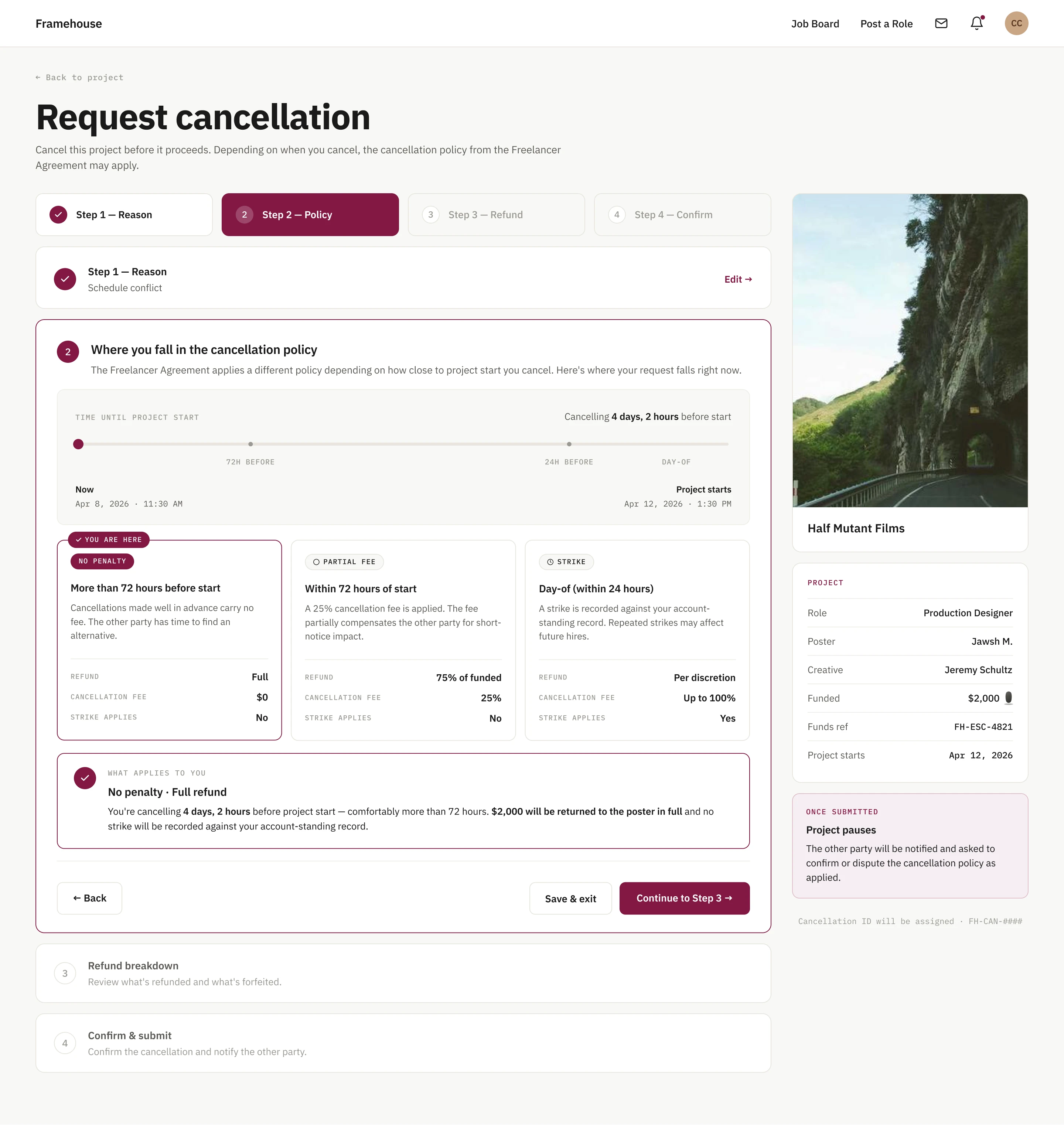
The wireframes were shown to a group of independent filmmakers, and they asked the question the product had not been designed for. What happens when someone does not turn up?
A single rule for every cancellation would have been simpler to build, and it would have broken the promise the platform is making. The person left without a crew member needs protecting. The person whose circumstances changed needs a route that is not a punishment. A policy that cannot tell three days of notice from two hours, or illness from a change of mind, gives the platform the appearance of fairness without the substance.
The solution was a tiered model, scaled to the notice the other party receives. Cancelling more than seventy-two hours before the start date carries no penalty and returns the full amount. Cancelling inside that window applies a twenty-five per cent fee, so the person left without work is partly compensated for the short notice. Cancelling on the day of the shoot makes the refund discretionary, puts up to the whole fee at risk, and records a strike against the account. A reason travels with every request, and the other side is asked to confirm the policy as applied or dispute it. Consequences also arrive in sequence, financial first and reputational only once a pattern forms, because a penalty with no room for a legitimate reason is not strictness. Such a rule punishes people for circumstances they could not control.
Framehouse is one loop travelled by two people from opposite ends. No job enters it without funds behind it, and neither person leaves it without a record.
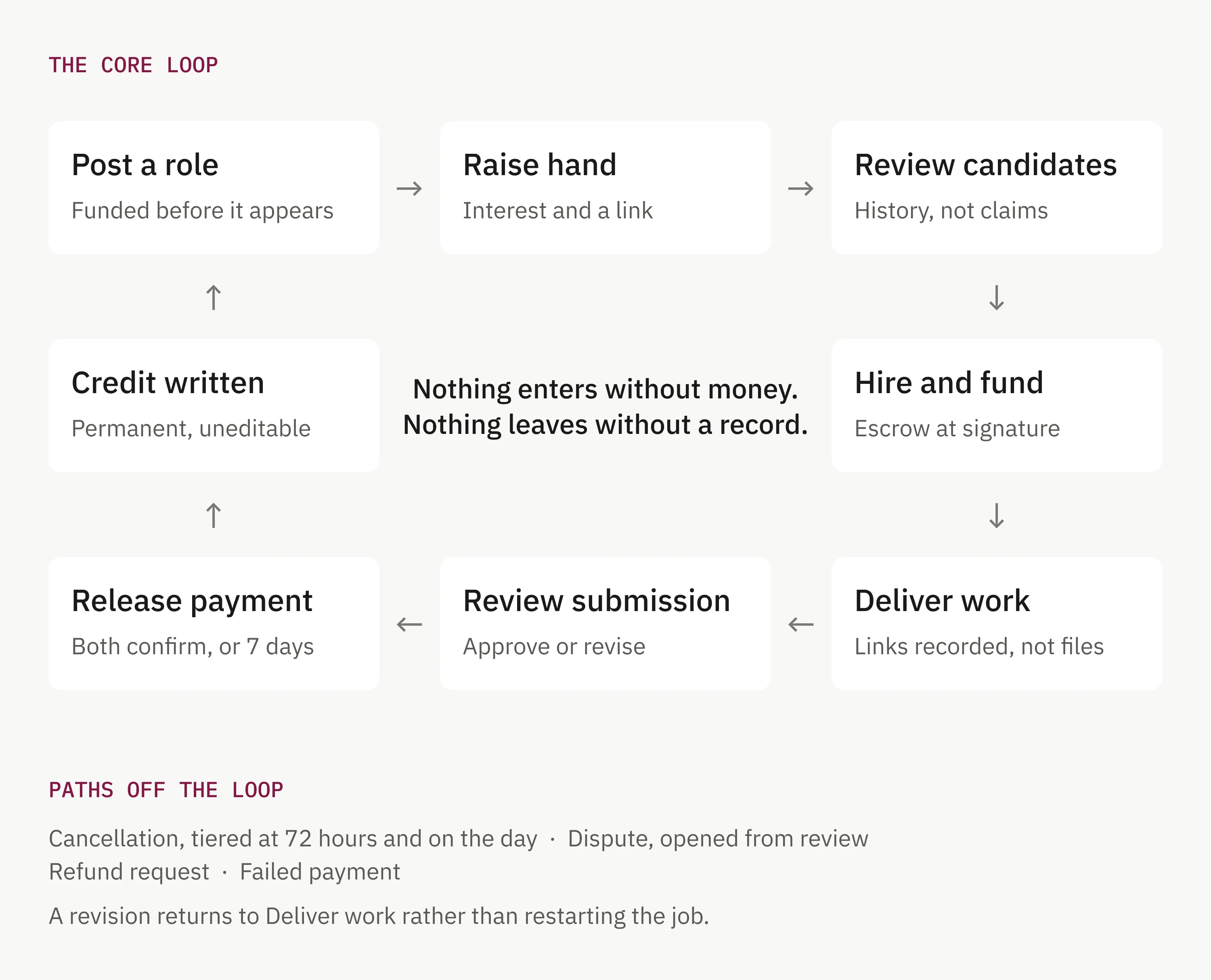
The loop is the same for both, but almost every stage asks something different of each side, and that asymmetry is where the decisions sat.
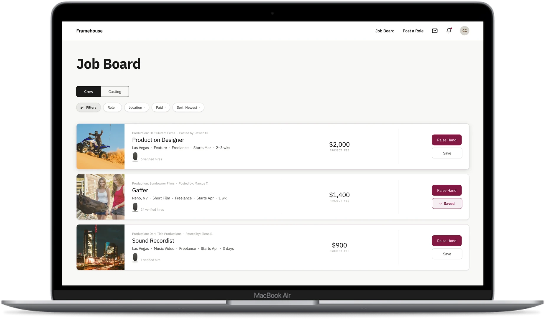
A role cannot be published without a pay figure, and the funds are confirmed before the listing appears. That ordering was a decision. Funding after publication would have filled the board with roles that might never pay, which is the failure the platform exists to remove.
Applying is deliberately light: a short statement of interest and a portfolio link, sent as a raised hand rather than a formal application. I argued for this because the crew member’s record already carries the evidence a covering letter only claims. If the profile is the proof, asking for the proof a second time is friction that filters for people with time rather than people with the skill.
Once a hire is confirmed, the agreement is signed and the payment moves into escrow at the same moment. Separating the two would leave a window where one person is committed and the other is not.
Delivery runs through Frame.io, Dropbox and the other tools filmmakers already use. The platform records what arrived and when, against the deliverables both sides agreed, without ever holding the files. Building storage would have asked an industry to abandon a working pipeline for a worse one, so the platform keeps the receipt without becoming the place the files live.
Once both parties confirm completion, the funds are released. A poster who stops responding does not strand the payment, because funds release automatically seven days after the crew member marks the work as delivered. That claim is not taken on trust alone: the delivery is timestamped against the deliverables both sides agreed at the hire, and the poster has those seven days to dispute it. That path exists because the person with the least power in the arrangement should not be the one absorbing somebody else’s silence. Reviews are written rather than scored, and neither party sees the other’s until both have submitted or the fourteen day window closes, which removes the possibility of a retaliatory review.
A credit is then written to both profiles. Each person reviews the details once and corrects anything wrong before locking it, and after that neither can edit or remove it. The correction step matters. Locking a record without letting either person check it first would preserve mistakes as faithfully as facts.
Not every job runs to completion, so the paths leading off the loop carry the same weight as the ones along it. Cancellation sits between the hire and the delivery, tiered by notice. Disputes open from the review stage, and if one party stops responding, the interface states plainly that the case will be decided on the other’s account alone. Refunds and failed payments have their own routes out of escrow. The failure paths took as long to design as the loop itself. A platform holding somebody else’s money is judged on what it does when a job falls apart, not on what it does when everything goes to plan.
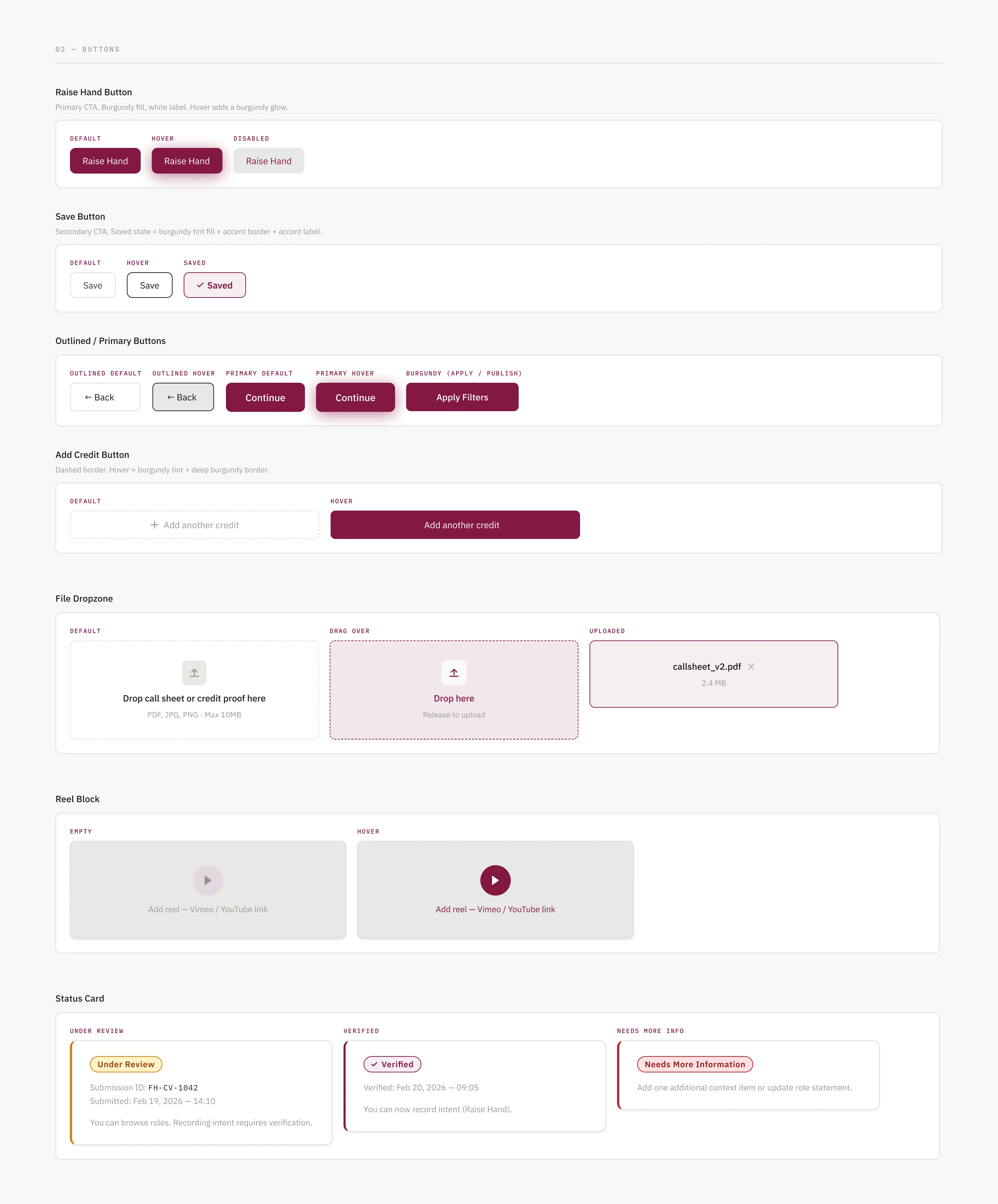
The handover was built for the developer, alongside the screens, a prototype and a component library, and a documentation set which describes how the platform works before it describes a single screen: who can see what, why registration is required before anyone can browse, why listings expire after forty-five days, how strikes are issued, and what a credit is. Each screen then carries its behaviour and its business logic, down to the detail of how a filtered view of the job board can be copied and shared as a working link.
A product strategy document sits underneath all of it. Pillars & Stones defines five values the platform stands on, eighteen feature systems that express them, seven personas drawn from the founder’s knowledge of the industry, and a measure for every system so the product can be judged once it is running. The screens show what the product does. The strategy document sets the measures that decide whether it is doing it.
The wireframes were in front of investors before the file was finished, and the company raised its first $50,000.
Be in the room when the work is read
The wireframes did reach independent filmmakers, and one of their questions redirected the entire cancellation policy. The founder showed them, in his own circle, and the feedback reached me second hand. What arrived was the conclusion, and what stayed in the room was the hesitation behind it. On the next project I would ask to sit in, because watching someone read a screen shows where they stall, while a written summary only reports what they concluded.
Two questions stay open because of it: whether someone with no verified hires understands why they are invisible, and whether the dispute flow feels fair to the person who did not raise it.
Prove a core pattern before spreading it
The stones were drawn onto nine screens before we had finally agreed what they measured, so one question turned into rework. Some of that is unavoidable, because a definition often only reveals its weakness once it has been applied to something. What I would change is the spread. A pattern that everything else depends on is worth proving on a handful of screens first.
Design the hardest case first
The brief was desktop-first with mobile handled in the notes, and there was no budget for a second set of screens. That was the right call commercially, and it is not the part I would change. The order is. The people this platform serves work on location, and a job card carrying pay, verification status and a stone is far harder to resolve on a phone than on a wide screen.
More projects