Website redesign for a High Court
A court website where colour tells a solicitor and a school group which part of the site they have arrived in
The High Court publishes the record of everything it decides, and it also opens its building to school groups and visitors. One website has to carry both.
Long story short: I redesigned a High Court website inside a government design system. Colour is what separates the sections built for work from the sections built for the public.
The website had not changed in over a decade. The redesign covered one homepage and seven section landings, with the pages beneath them, and every screen came out of CivicTheme, an open-source design system published for government websites and tested against WCAG 2.1 AA.
One set of pages had to serve a solicitor working to a filing deadline and a school group planning a visit. The site they shared was organised around what the institution publishes, so neither could see which part of it belonged to them.
The brief described the institution’s voice as respectable and conservative. A court carries authority partly through restraint, and the usual moves for making a public section feel welcoming, warmer colour, looser layout, friendlier language, would have worked against that authority. Whatever separated the two audiences therefore had to be quiet enough to belong to the institution.
Seven landing pages sit under one homepage, and the split between them runs by audience. Justices, Cases, Registry and Library serve practitioners. About Us, Our Story and Tours & Learning serve visitors, schools and anyone reading out of curiosity.
CivicTheme set the second constraint. A design system arrives with its components already decided, and this one carries an accessibility assessment that only holds while its own parts are used. Every answer therefore had to be assembled from parts the system already had.
Three challenges shaped the design, and the answer to each came back to the same observation. A court publishes records and takes filings, so most people arriving have something specific to do, though not all of them know what it is called. Every screen therefore had to confirm where a reader had landed before it offered anything else.
Making the split visible
The first challenge was that the site gave no sign of which audience a page belonged to. Registry is where a solicitor files a document. Our Story is where a school group reads about the building. A single accent colour ran across the whole site, so arriving at either one looked the same, and the most useful distinction on the site stayed invisible.
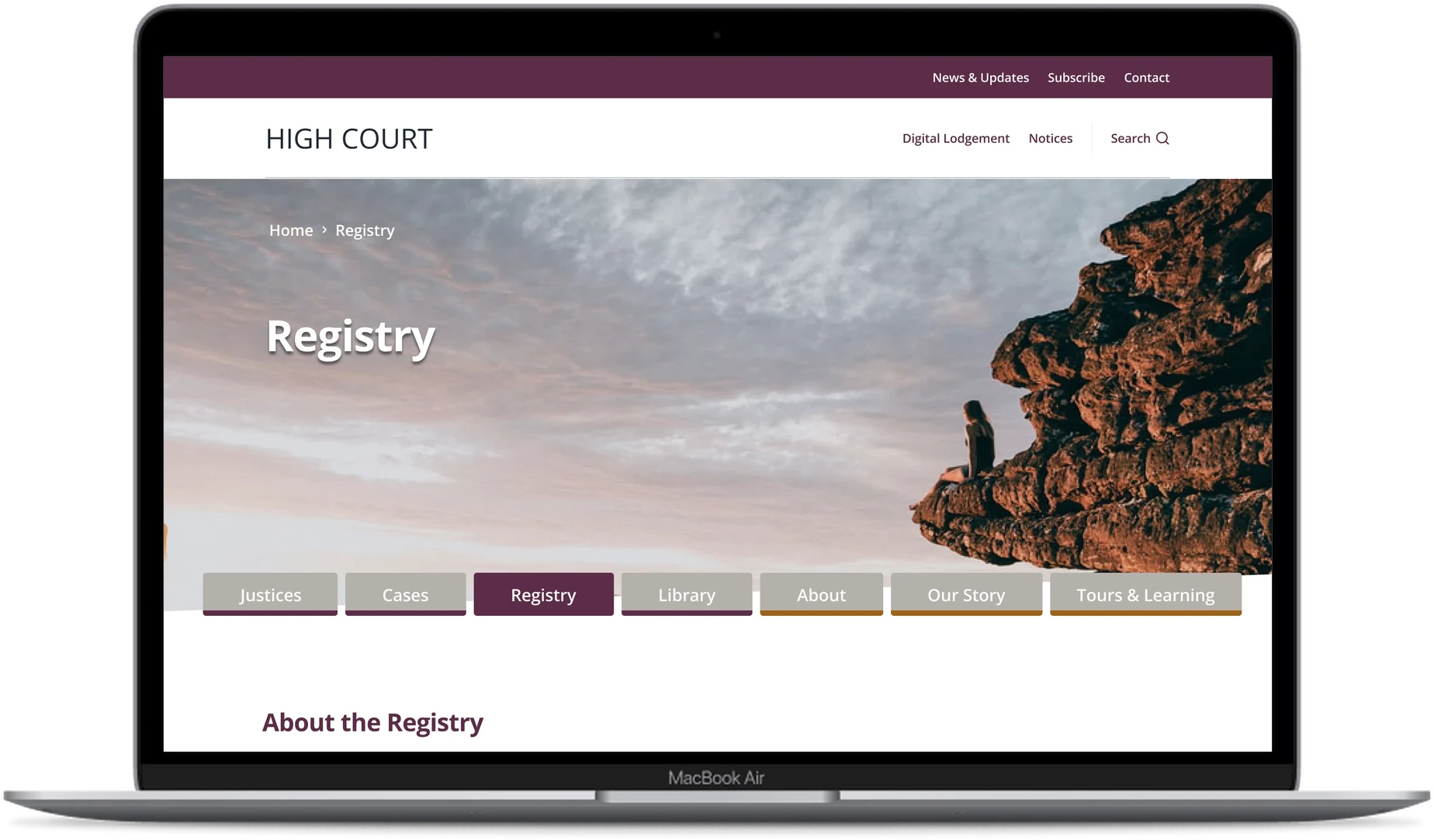
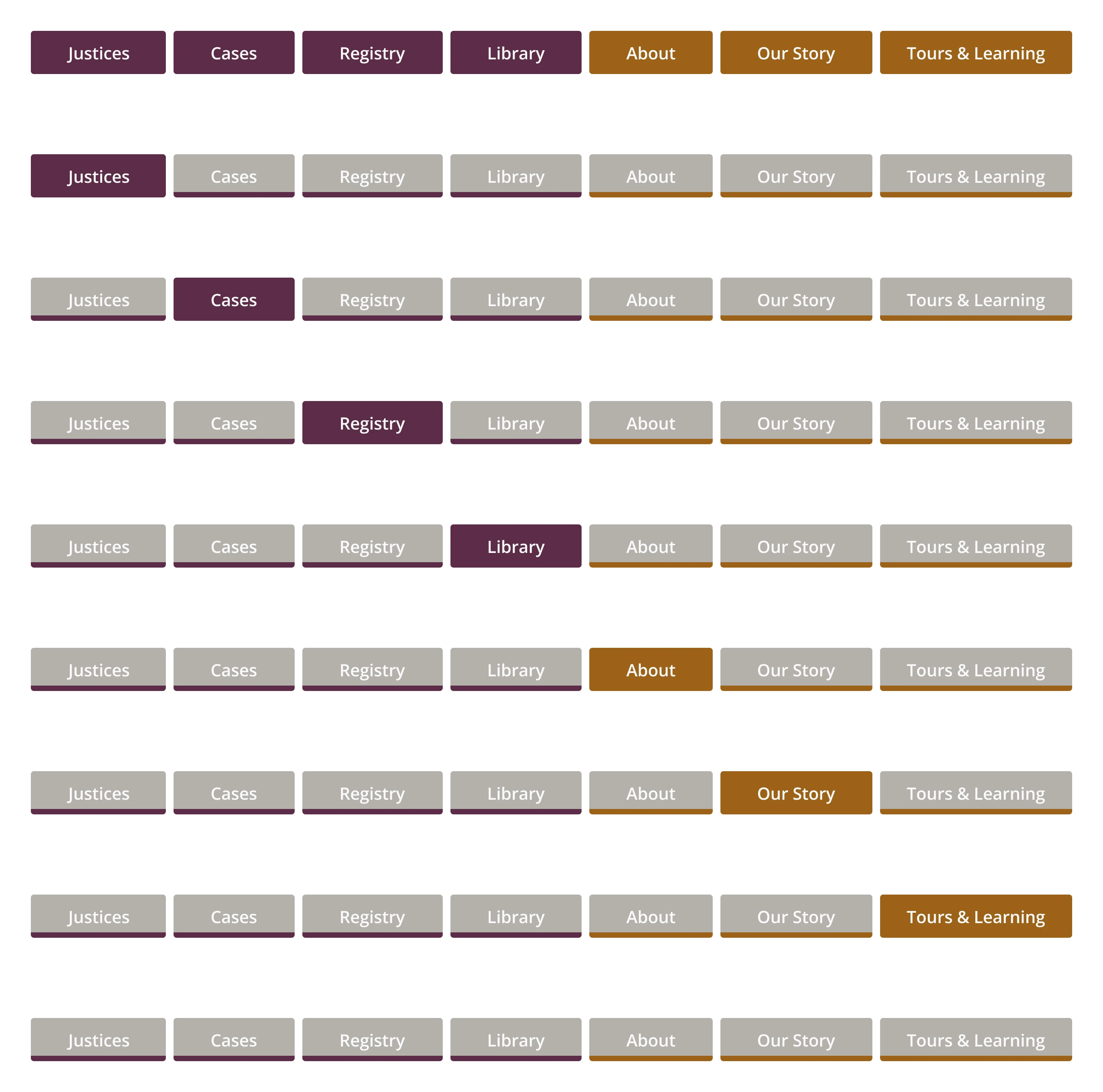
Colour became the signal. Purple went to the four working sections, gold to the three built for the public, and both repeated everywhere the split mattered: the bar above the header, the active tab, the underline beneath each menu panel.
Which family took which colour would not settle in words. I rebuilt the entire page set with purple and gold exchanged and put the two versions side by side, and seeing them together settled the choice.
Colour alone would have been a poor way to carry structure, since it vanishes for anyone who cannot separate the two hues. Each tab, bar and underline therefore carries its own name in text.
Four signposts instead of one
Orientation was the second challenge. Someone with a filing deadline is working under pressure, and pressure makes people lose their place. The side navigation opened the branch a person was in and closed the rest, which suits a shallow site. Seven sections with several levels under each is not a shallow site, so the whole structure had to stay on screen.
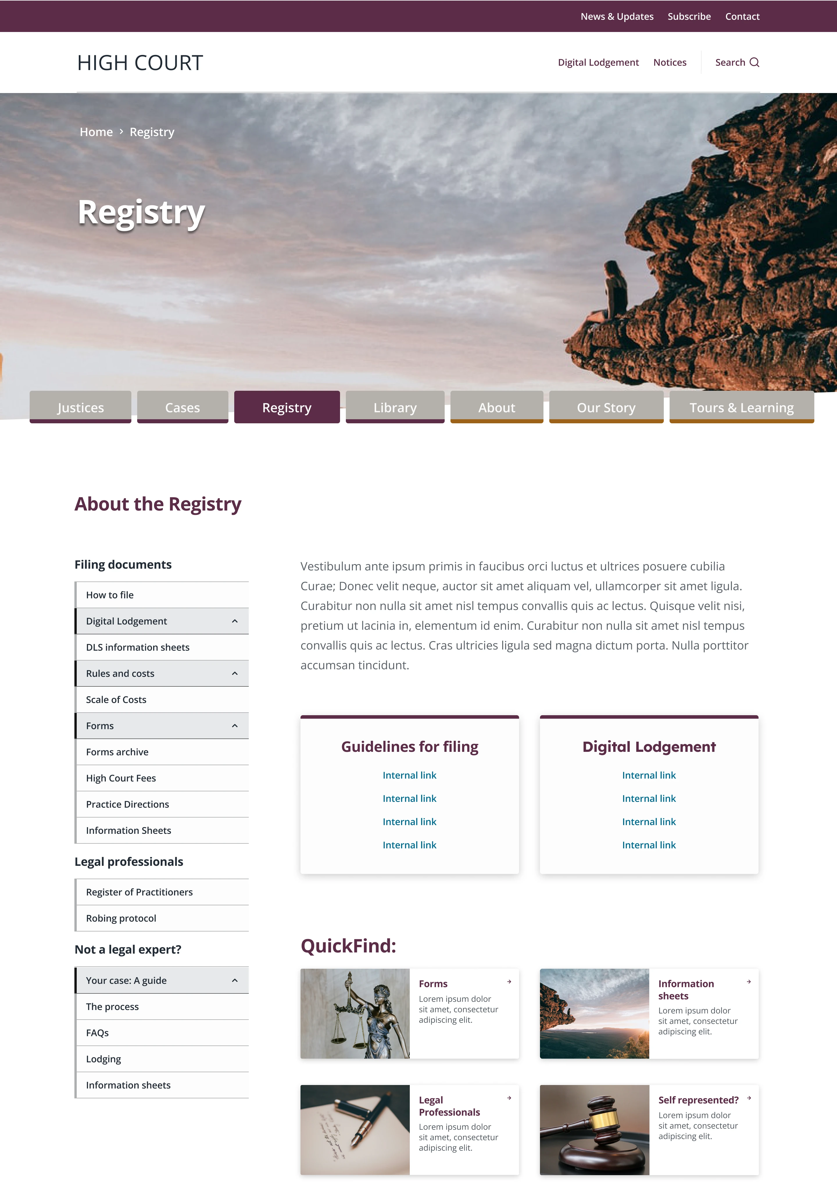
The answer went into four places rather than one. A breadcrumb and the page name both sit on the hero image. A row of seven tabs sits across the bottom of the image, with the current section filled in its family colour. The side menu then stays open permanently, so a section’s whole structure remains visible while someone reads.
Any one of the four would serve as a signpost. Together they mean a person picks up their position from whichever device their eye lands on.
The homepage stopped promoting and started asking
The homepage posed the third challenge. Someone holding a case number has one question, and the page led with two promotional buttons, which serve an organisation with something to announce. A court’s visitors mostly arrive with something to find.
A search field replaced the buttons, under the line “What can we help you find today?”. Four cards sit beneath it for the requests that come up most, so a person who knows the term can type it and a person who does not can recognise it in a card.
The split holds at every level. Two audiences share one homepage, separate by section, and then separate again inside the sections themselves.
A solicitor lands on the homepage and types a case number into the search field. Someone less certain uses a card beneath it instead. Either route leads into a purple section, and the purple bar above the header confirms the arrival before a word is read.
Registry opens with its whole structure showing. Filing documents and Legal professionals sit at the top of the side menu. A third branch, Not a legal expert?, catches the person who has a matter before the court and no lawyer to guide them.
A teacher planning a visit takes the same homepage into gold. Tours & Learning divides the way Registry does. One branch serves schools, with student tours, classroom resources and excursion preparation. Another serves the public, with court etiquette, visitor requirements and tour bookings.
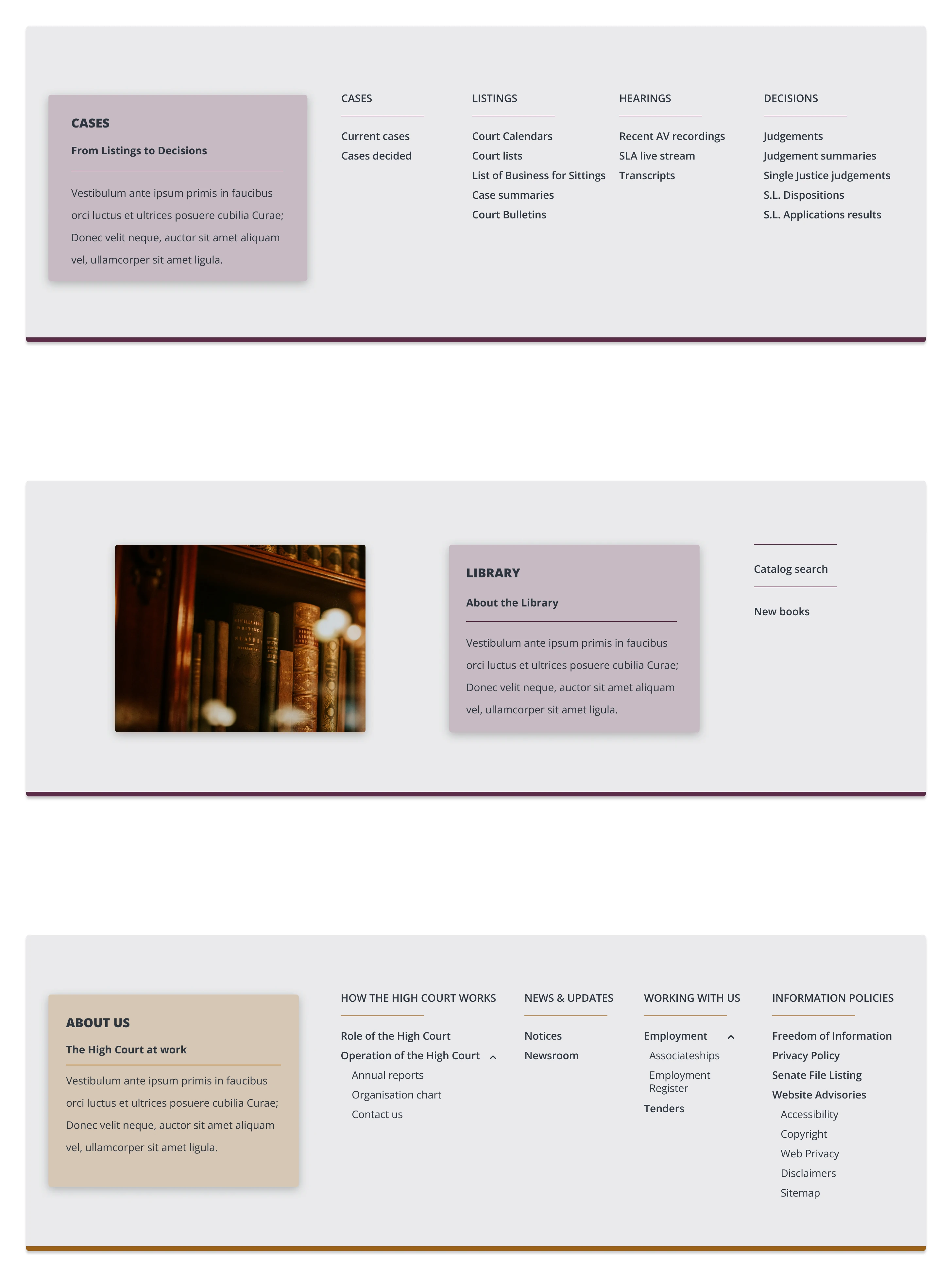
The main navigation carries the split too. Each section drops a panel holding its name, a line describing it and its contents in columns. Library and About are neighbours in the tab row, so the underline changes colour between one panel and the next.
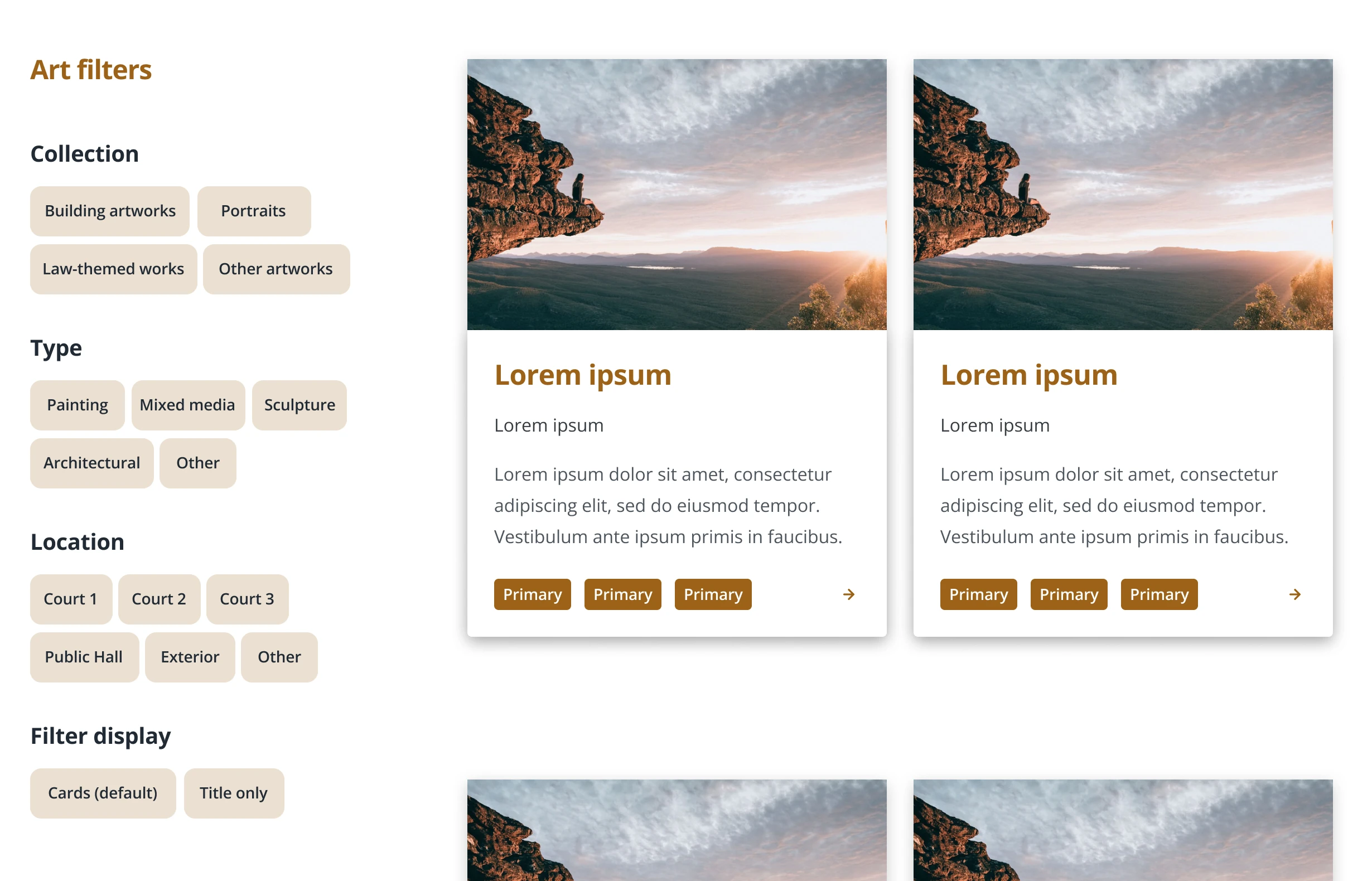
One page presented a challenge the kit had no ready answer for. The institution holds an art collection, and a collection needs facets a document library never has. A visitor wants to know which room a work hangs in, whether it is a painting or a sculpture, and whether to browse pictures or titles.
The kit’s publication library already did most of the job. A filter column beside a grid of cards behaves the same way whether the cards hold documents or artworks, so the component carried over unchanged and only the filters were written from scratch.
The institution approved the result for publication. The work included no user interviews, so every decision was argued from the structure of the institution rather than from something a user had said. Two things came out of the project that I now carry into other work.
A conservative voice limits decoration, not clarity
The brief asked for a voice that was respectable and conservative, which ruled out the usual ways of making a public section feel welcoming: warmer colour, looser layout, friendlier language. The distinction between the two audiences therefore had to be carried by structure and by two muted institutional colours. A quiet colour can still be unmissable when it turns up in the same places on every page.
When a visual choice will not settle in words, build both
Which family took purple and which took gold would not settle in conversation, because everyone involved was describing a picture in their own head. Rebuilding the page set with the colours exchanged answered the question in one look. Showing two versions costs less than a long exchange about either, and far less than letting the wrong one survive to handover.
More projects