Network analysis tool
A graph tool organised around what analysts are looking at, rather than what they want to change
A network graph draws people, genes or bank accounts as points, and the relationships between them as lines, so patterns hidden in a spreadsheet come into view. Software for this work has traditionally lived on the desktop, where the analysis is deep and the interface is built for specialists. This tool puts the same analysis in a browser, as open source, for researchers who read data fluently and do not write code.
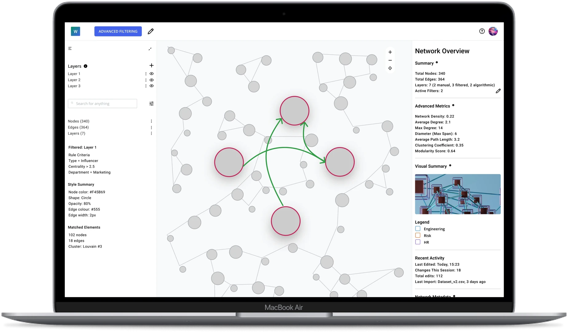
Long story short: I was the sole UX designer on a network analysis tool that existed as a proof of concept with no interface. I asked what an analyst is holding in mind when they open a graph tool, and the answer moved the product off the structure I had given it.
The client, a developer, had built the analysis engine, and the interface did not exist yet. The brief opened with a suggestion, a panel modelled on Figma and Photoshop with a layer system underneath, and it invited other ideas. The question underneath that suggestion stayed open: which idea sits at the top of the screen.
The same interface has to serve two very different people. One is mapping how a team works together. The other is tuning the physics of a force-directed layout. Whichever idea the interface puts at the top level decides how much work each of them does to reach what they came for.
Three decisions followed. I drew the prevailing convention first and established where it breaks. I moved objects above actions. I collapsed two overlapping concepts into one, so every route through the tool now ends in the same object.
Graph analysis asks people to choose between analytical power and being able to use the software at all.
Scientists, researchers, analysts and data engineers make up the audience, and the available software divides along precisely the line between reading data and writing code.
Cytoscape and Gephi hold the deepest analysis, and both run as Java desktop applications whose interfaces were built for specialists. Sigma.js is a rendering library rather than a product, so a development team has to build an interface around it before an analyst sees anything. Cosmograph draws very large networks quickly in a browser, with the layout running on the GPU. Its strength is speed at scale rather than the depth of graph theory Cytoscape and Gephi carry. KeyLines and Polinode are commercial products, the first a toolkit a development team builds with, the second a subscription platform. The brief describes both as prohibitively expensive.
The client supplied a comparative study of the six tools, covering features and architecture. Research of that kind describes what already exists rather than what to build, so I worked through it and rebuilt it as a set of constraints the design could be measured against: for each tool, one strength worth carrying in and one weakness worth keeping out.
| Tool | Carry over | Keep out |
|---|---|---|
| Cytoscape | Attribute-based styling, a flexible panel layout, several networks at once | A steep learning curve behind a complex interface |
| Gephi | Real-time interaction, intuitive filters, an overview kept separate from the preview | Memory limits and constant mode switching |
| Sigma.js | Fast rendering in the browser, deep customisation | A developer-only surface with no analytics built in |
| Cosmograph | A clean interface, histogram filtering, GPU layouts | Thin analysis and the absence of customisation in the interface |
| KeyLines | Enterprise-grade interaction, combined nodes, timeline and map views | A closed platform that needs a developer, and feature overload |
| Polinode | Approachable onboarding, built-in metrics, collaboration | Limited extensibility, no scripting access, performance ceilings |
Four entries in the table can be traced into the final screens. Cytoscape’s attribute-based styling became a rule builder that selects on type, department and centrality. Gephi’s separation of the overview from the preview became a network summary that sits beside the canvas rather than replacing it. Polinode’s built-in metrics became a metrics block carried by every selection. I designed out Gephi’s mode switching by giving the interface a single panel that changes with the selection, rather than a mode for each task.
One pattern came out of the comparison. The four that ship a finished interface each put a different idea at its top level: some lead with modes, some with types of setting, some with the data itself. Each of those answers sends its users down a different number of steps to reach the same result.
The brief raised the stakes further. The design had to serve as the foundation for a first build and still hold years later, as features arrived that had not been specified yet.
Every decision came back to the same question. What is the analyst looking at, and does the interface have it at the top?
Drawing the convention before arguing with it
Analytics tools mostly lead with actions, and Polinode is the clearest example of the pattern. Colour, size and labels each get a screen of their own, and the arrangement is defensible, since one screen handles one kind of setting and the interface stays modular. I drew that version first. The fastest way to find the limit of a convention is to build it and then look for the case it cannot hold.
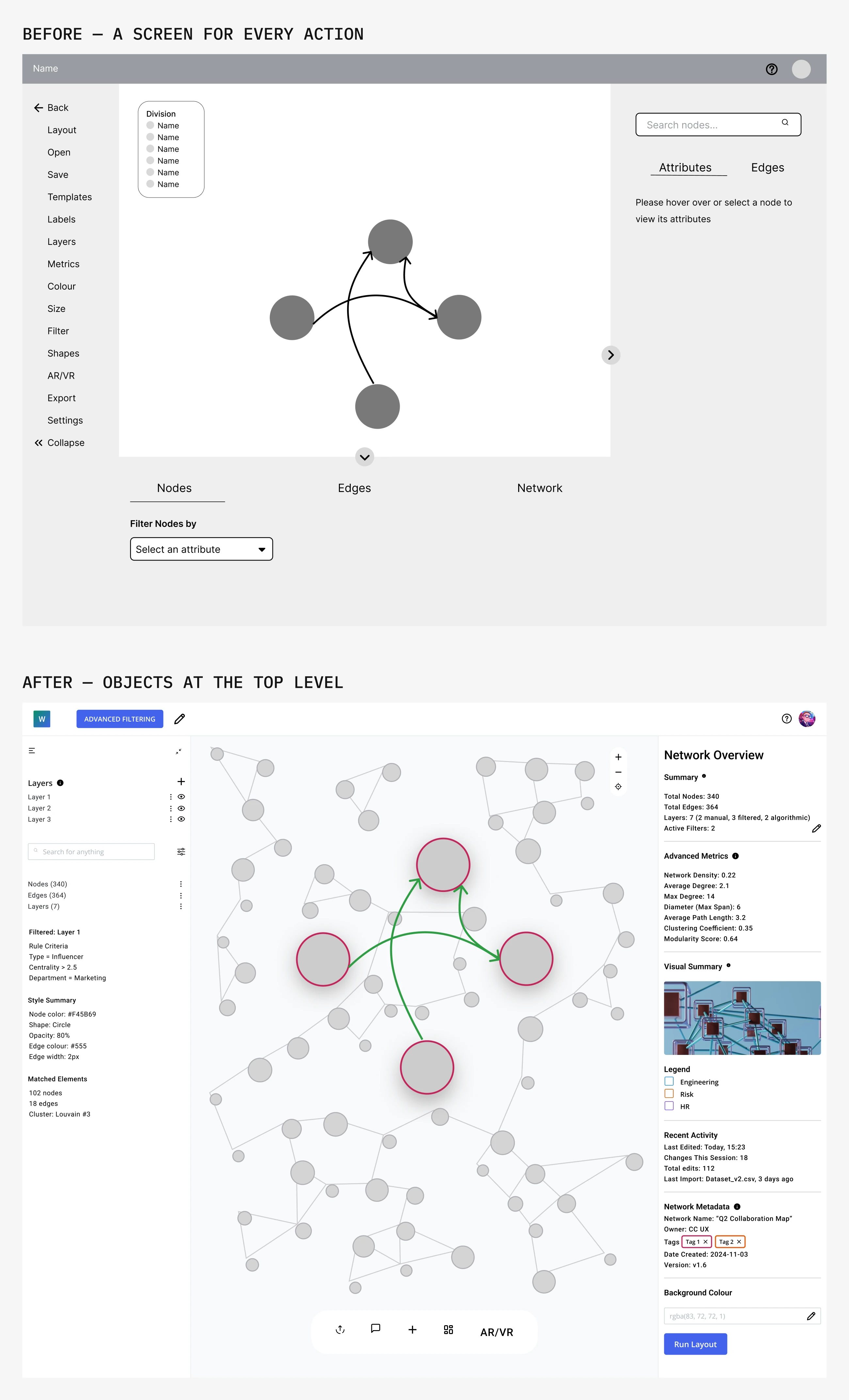
My first exploration gave each action its own screen. Labels, Layers, Metrics, Colour, Size, Filter and Shapes ran down the left, among the file and view commands. Each screen opened a panel with nodes, edges and the whole network as tabs along the bottom.
The case arrived quickly. Action-first works while a change applies to everything at once, and it breaks the moment an analyst is working with one group of people rather than the whole network. Making every influencer larger, darker and labelled means opening four separate screens, one to find them and three to style them, and stating the same criteria in each.
We talked the structure through, and the argument for inverting it is the clearest statement of the problem the project turned on.
“Users will want to focus on certain types of nodes, edges, groups, or paths first (the ‘objects’ of the design) because they are directly related to the subject matter they are trying to understand. Styling is secondary and intended to help them identify and focus on relationships and patterns.”
I moved objects to the top level. The brief had offered Figma’s panel as a starting suggestion, and the exploration is what turned that suggestion into a reason. A designer in Figma selects a shape and the right-hand panel becomes that shape’s own properties: its fill, its size, its text. Properties sit with the shape rather than behind a menu named after each one.
The same principle here gives a node, an edge or a group a single place holding colour, size, labels and filters. An analyst therefore describes a selection once and changes it in one place.
Three people who were never in the room
The new structure decided the top level, and it left the behaviour underneath open. The right-hand sidebar, the contents of the toolbar and the moment immediately after an action were all unresolved. We stepped back and mapped the journeys before going near high fidelity.
Anna is non-technical and wants to see how her team works together. James is semi-technical and imports messaging data to find where collaboration between teams breaks down. Lina is a network analyst who wants control of the algorithms and access to the raw data.
The three came from the brief and the client’s knowledge of the field rather than from interviews. The maps are therefore a structured way of reasoning about the work, not evidence gathered from the people who do it.
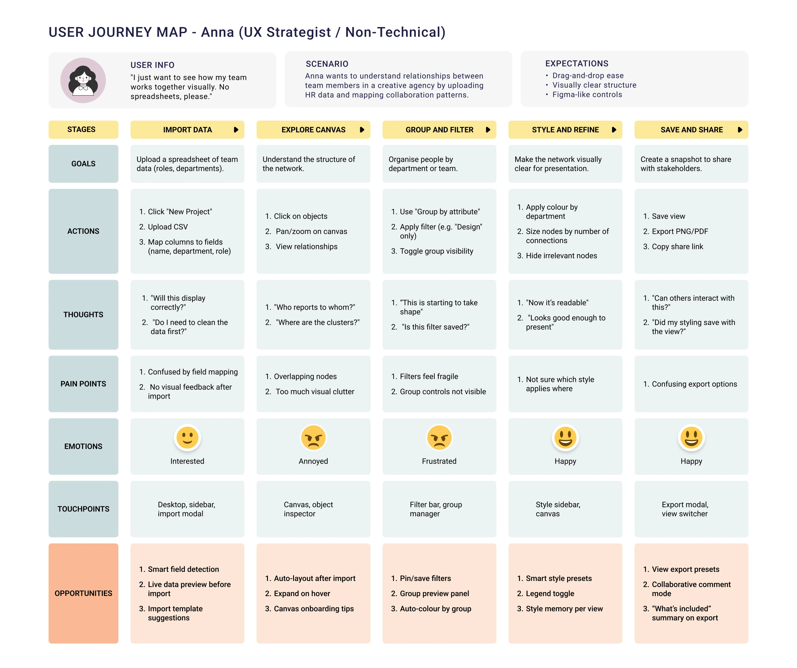
Five stages each, from loading the data to sharing the result, produced six patterns holding across all three journeys. Two of the six decided the interface. Every persona expected to click an object and edit it, which set the sidebar to follow whatever is selected instead of sitting still. Confusion clustered in the moment after an action, which set every action to confirm itself on screen.
James and Lina both needed to hold one dataset against another, and multi-layer support entered the design there. I built each pattern into a part of the product. A panel follows the selection, a count appears before any filter runs, and layers stay in one network for an analyst to show or hide.
The maps carried one more finding, filed under concerns rather than recommendations. Layers were unclear.
What is the difference between a layer and a group?
Updating the information architecture showed why. Layers and groups sat on the same map, reaching the same place by different routes. Layers were visual subsets an analyst could switch on and off. Groups were selections an analyst could act on. Both could be created from a filter, both carried styling, and both reported their own metrics.
The two definitions held apart on paper and collapsed in use. Both described one act: pulling part of the network out and doing something with it. Keeping two names for one act moves the work of remembering the difference onto the analyst.
I merged them. A layer now means any set of nodes and edges pulled out of the network, however it was produced. The network overview still counts the layers by how they were made, whether an analyst drew them, filtered them or ran an algorithm. Merging the two concepts therefore left an analyst able to see which selections a machine produced.
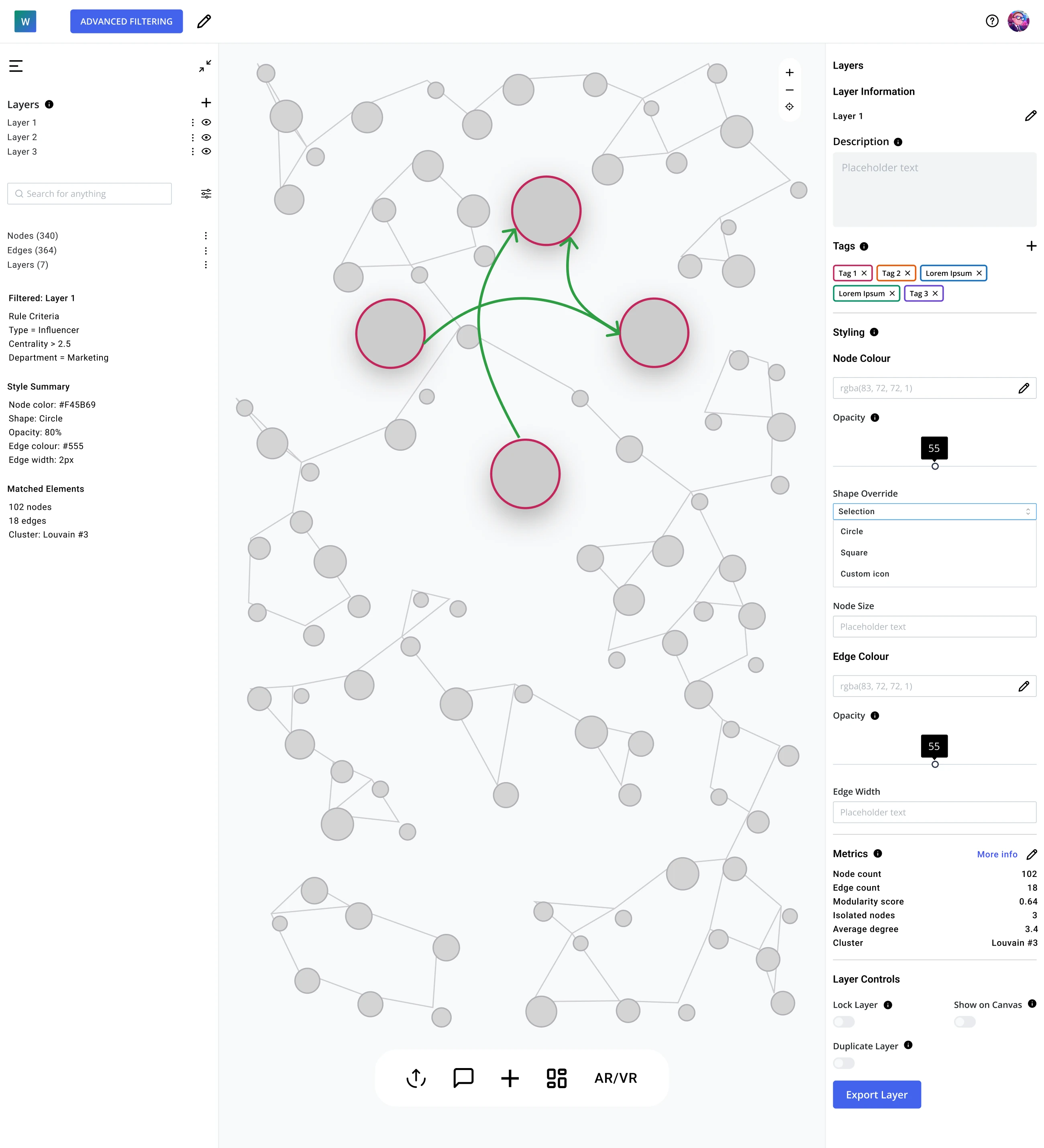
One idea carries the whole product. An analyst pulls part of a network out, by hand, by filter, by search or by running an algorithm, and every route produces the same object: a layer.
A network begins from a template or a four-step import. A template lists its contents before an analyst opens it, so someone choosing an org chart sees in advance that it carries people, organisations and reporting relationships.
Narrowing a network is where the two kinds of user separate. One thinks in attributes and wants to ask for everyone in marketing whose connections put them near the centre of the network. The other thinks in queries and would rather write one.
Hiding the query would have been the conventional choice, since the non-technical user is the one this tool exists to reach. I put the query on screen instead. The rule builder composes conditions in plain rows and prints the query those rules produced. The network that came back is drawn below it, with the count stated alongside: 102 nodes matched out of 340.
An analyst who writes queries can read the query and edit it. An analyst who does not can see what the rules will do before applying them.
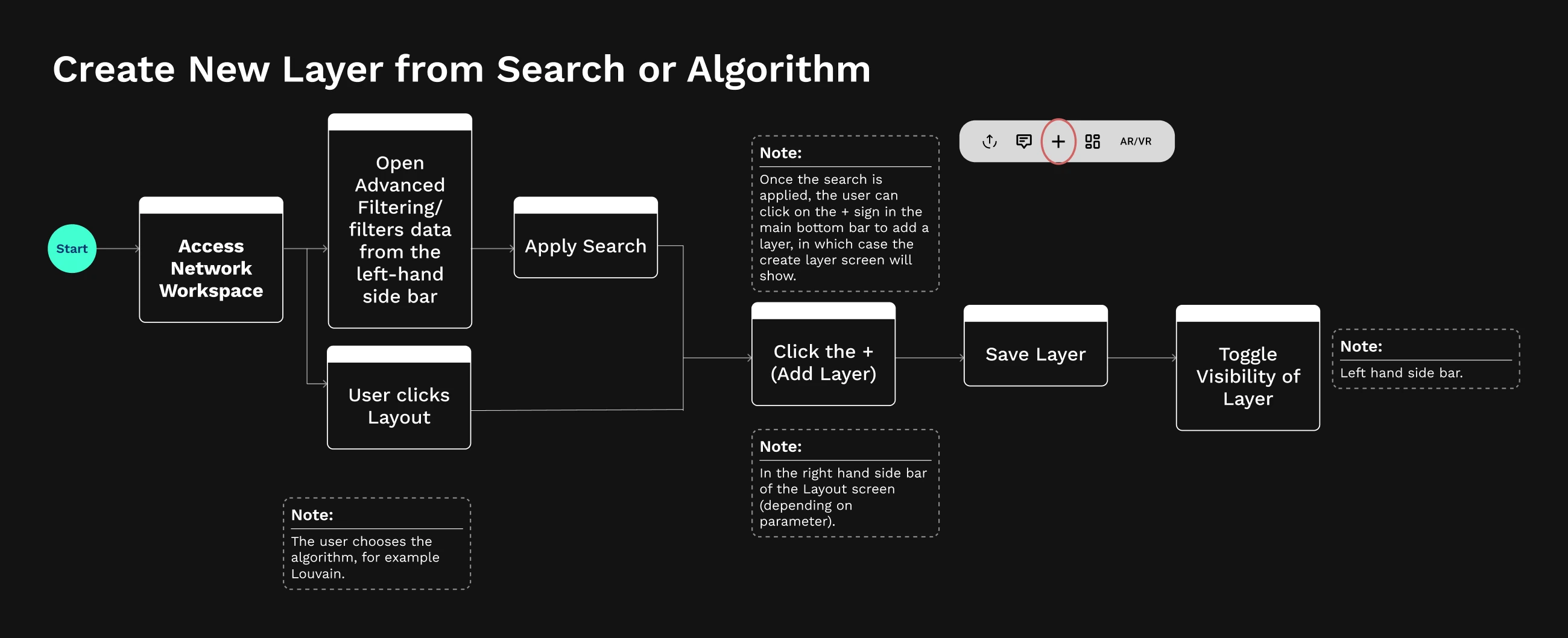
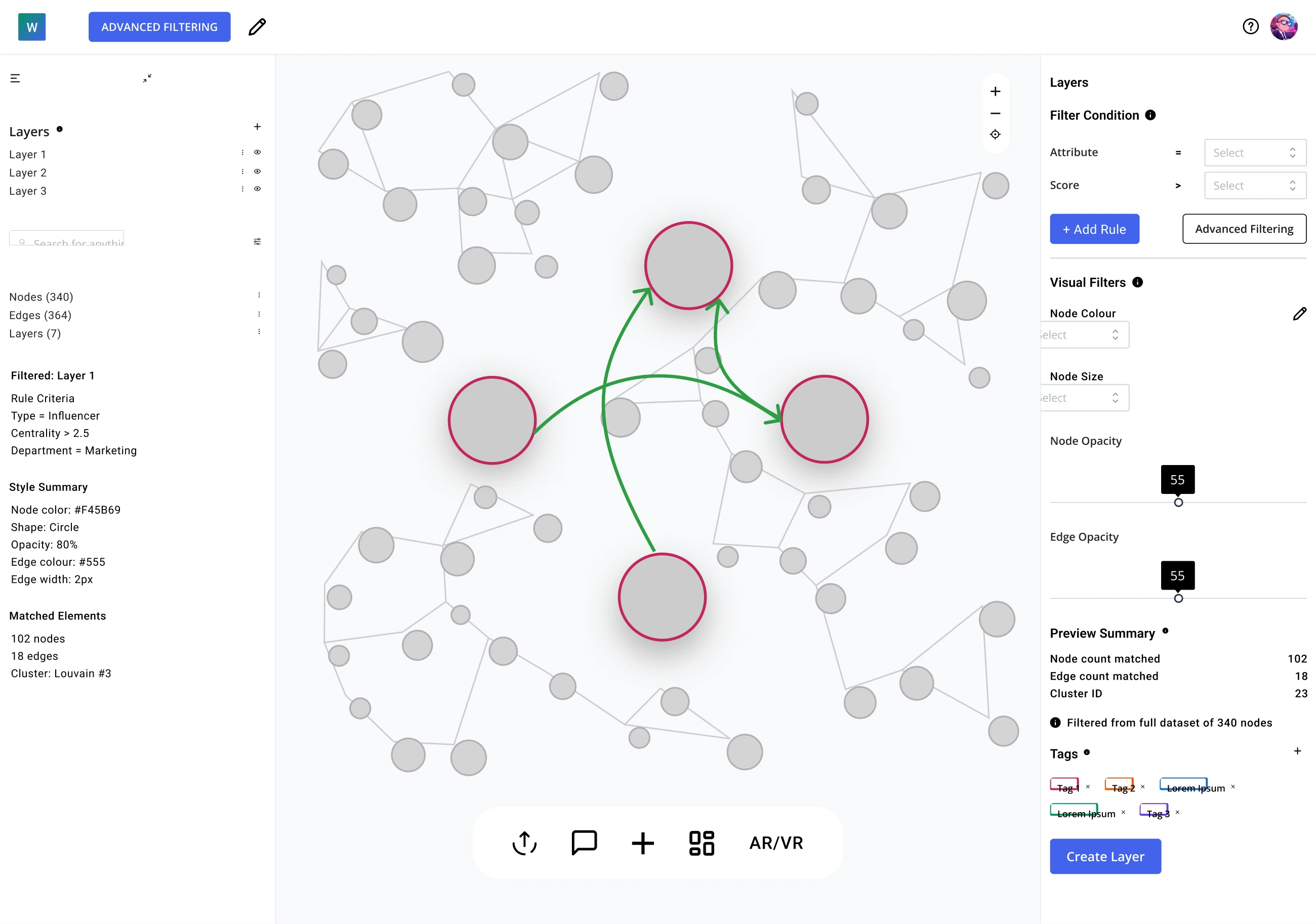
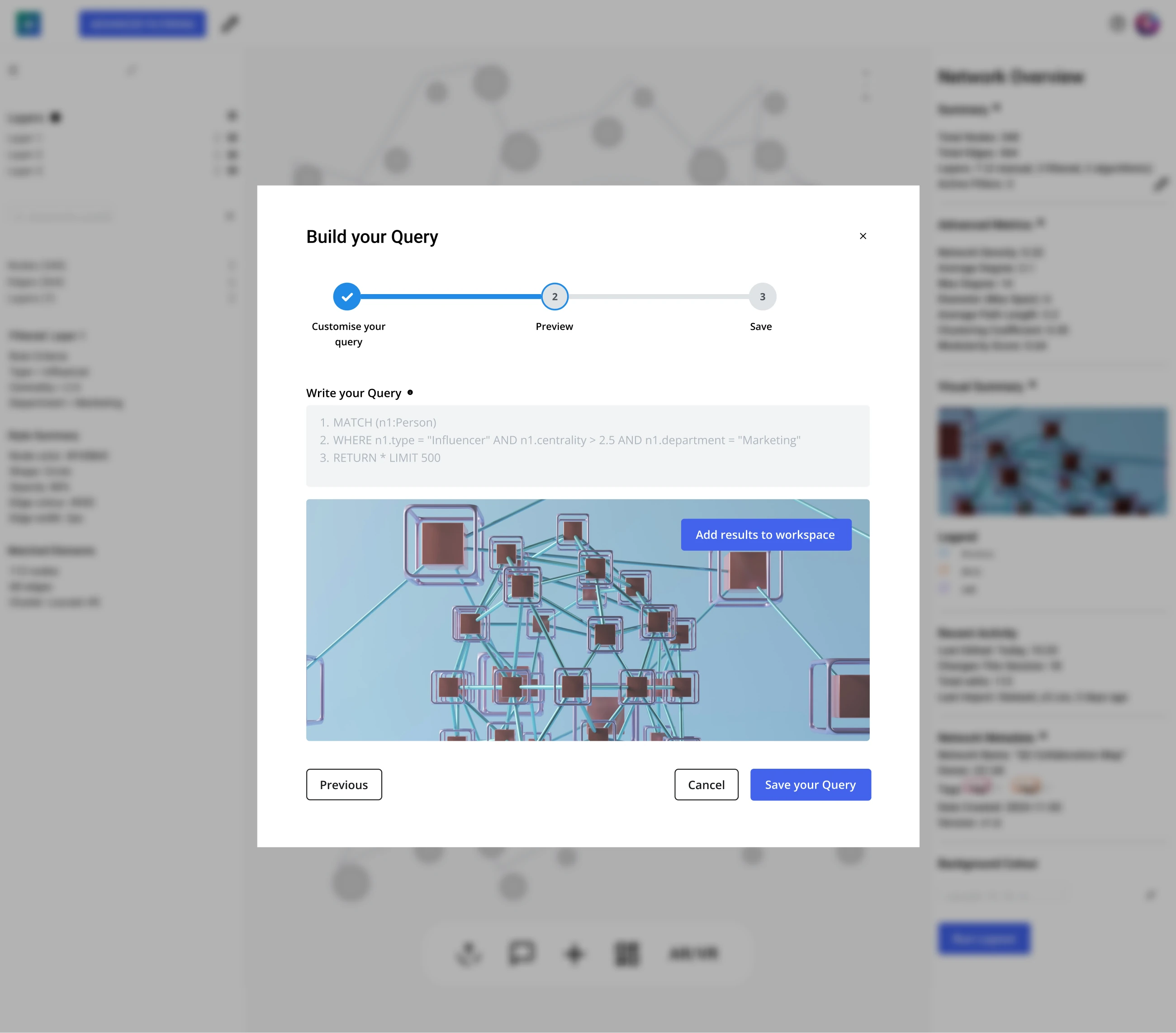
Whatever produced the selection, the result saves as a layer. Each layer then holds its own styling, its own metrics and its own controls. A single set of people can therefore be recoloured, counted, hidden or exported on its own, without the rest of the network moving.
Layouts were the case that tested the idea. A layout rearranges the whole network, spreading clusters apart or wrapping them in rings around a chosen centre. The obvious home for one is a setting on the network itself. A setting, however, makes two arrangements impossible to compare, because the second replaces the first.
I made a layout produce a layer like everything else. An analyst can therefore save a force-directed arrangement and a radial one as two layers, then move between them to decide which shows the structure more clearly.
Delivery was a Figma file and a working prototype. The brief fixed React-based development and left the component library open, naming Material, Mantine and Chakra as some options.
I recommended Mantine, because a graph tool leans on the specialised components rather than the common ones: multi-step wizards, tag inputs, range sliders, nested menus, combo boxes and date pickers. Mantine carries all of those in its free set, where the Material equivalents for data-heavy work sit behind a commercial licence and Chakra’s range is narrower. I drew every screen from it, so the development team receives components it already has rather than pictures to interpret.
Map the journeys before drawing the first structure, not after
The journey maps arrived after the first set of wireframes, and they answered questions the wireframes had raised. Run in the other order, the same maps would have shortened the first exploration. The pattern that settled the sidebar was in the journeys, not in the screens. Mapping costs a few days. Redrawing a structure costs a phase.
Structure is the one decision a better screen cannot fix
The tools in the comparison are competently drawn. What separates them is not the drawing but the idea each one organises itself around. A panel that confuses people can be redrawn on its own. A structure that asks for the same set of people to be defined four times has to be rebuilt from the wireframes up, and every screen standing on it goes with it. The opening of a project is therefore worth spending on a question that produces no screens.
Show the machine’s working rather than asking for trust
Designing for non-technical users usually means hiding complexity, and this product does the opposite at the one moment where it counts. Showing the query, the result and the match count costs a step at the point an analyst is keenest to get on with the work. The step buys something a simpler screen cannot: an analyst who agrees to the change before it happens.
More projects