Kubernetes desktop management tool
A management tool where the navigation collapses on request, leaving the whole screen to the cluster being watched
Modern software runs as dozens of small programs spread across many machines. Kubernetes is the system that places those programs, restarts them and keeps them running. A cluster changes continuously, however, and a command line answers one question at a time. This tool puts the whole of a running cluster on one desktop screen, for the developers, operators and administrators who work with clusters daily.
Long story short: I was the sole UX designer on a desktop tool for managing Kubernetes, benchmarked against two existing applications, Lens and Octant. One question shaped every screen, namely how much of the display the interface may occupy.
Kubernetes exposes a great deal of structure, a tree of resources that runs to dozens of entries once opened. Every tool of this kind has to put that tree on screen somewhere, and the crowding that follows is what makes these tools hard to design for.
The product is free and open source, and the client was a developer who ran clusters daily, so the design answered to operators rather than to a business. The established tools answer the crowding by keeping their interface on screen permanently. A bar sits across the top, a rail of saved clusters runs down the side, and a terminal docks along the bottom. I took the opposite position, that anything the cluster is not using should be reachable rather than resident, so each of those three moved out of the cluster view.
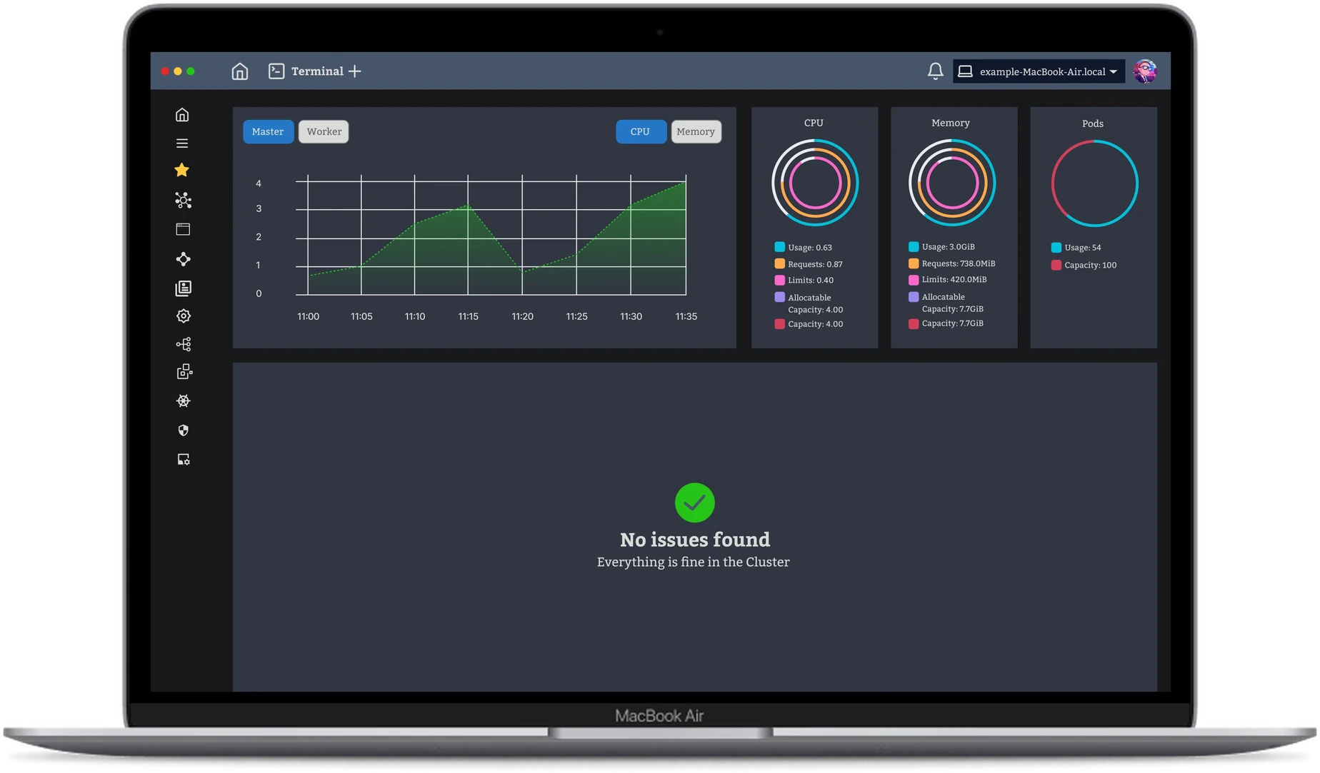
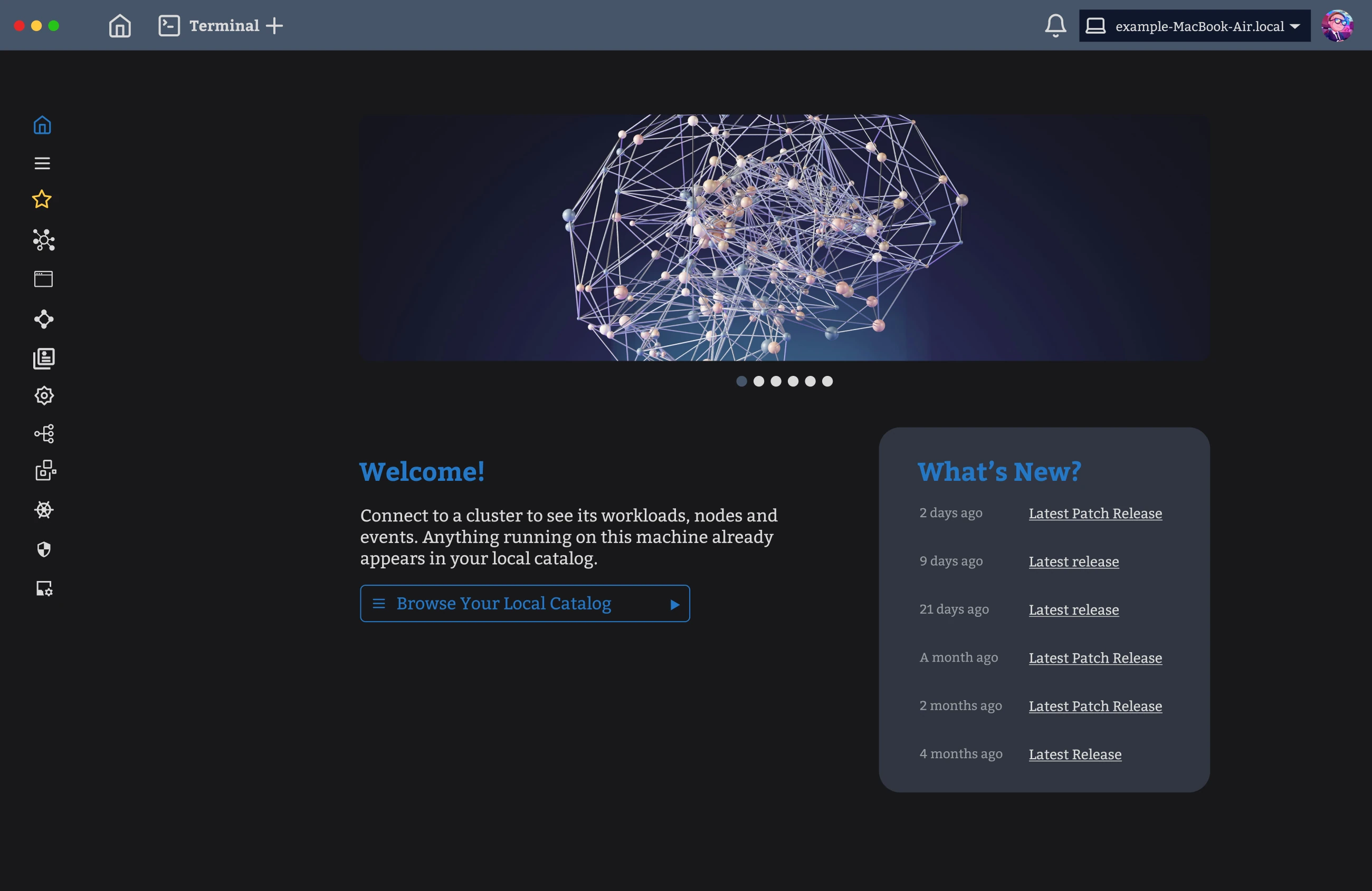
The finished tool has one navigation column, and the column shrinks to a strip of icons whenever the cluster needs the room. The rest of the screen belongs to the cluster: what is running, what has changed, and whether anything is wrong.
A tool for watching a cluster takes screen space away from the thing it is meant to show. Every bar, rail and panel belongs to the tool rather than to the cluster.
A survey of Kubernetes users, reported by DEVOPSdigest, ranked what they struggle with. Performance tuning came first at around 60 per cent, and the volume of configuration files second at around 55 per cent. Tuning performance means watching what a cluster does over time, so the top difficulty in the survey is a display problem as much as an engineering one.
I ran a competitor analysis of Lens and Octant before drawing anything. Lens was the more established of the pair, and a good deal of what it did well went into my constraints. Information arrived a level at a time, a marker showed which section was open, and status was carried in colour.
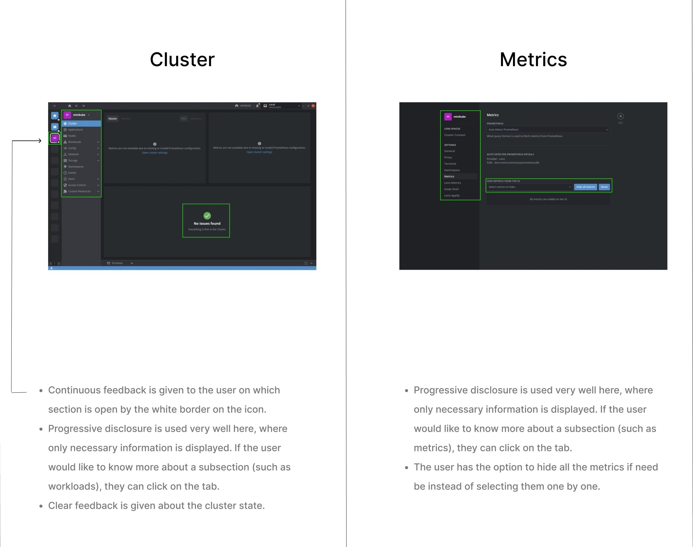
Octant crowded the screen a different way. Sections sat in separate containers, yet one view carried so many of them that the page read as overload, and that view offered no bar across the top to order them. Search was inconsistent, missing from some screens and hard to find on others. Processor and memory arrived as bare numbers, and no chart showed movement across a period, so change stayed invisible.
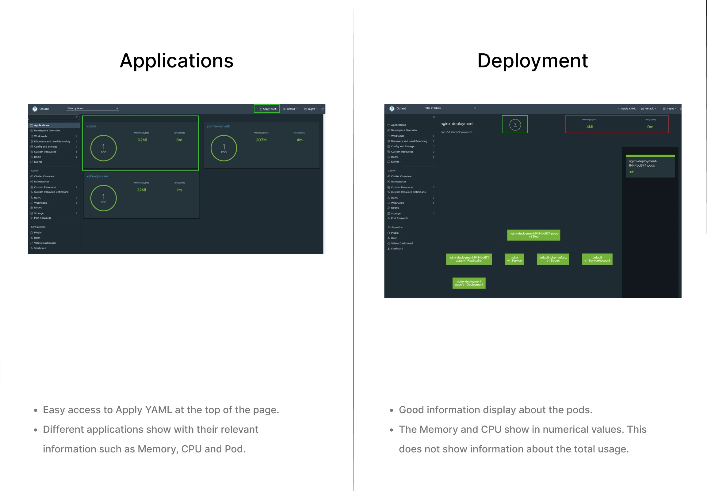
One pattern ran through both readings. The difficulty in each was how much room the interface held permanently, rather than the quality of any single screen. Therefore I set one test for every element in the design: what does it cost the cluster in space, and what does the cluster get back?
The audience is expert and small. The same article places most Kubernetes clusters in information technology firms of ten to fifty people who already know the system well. Users at that level do not need the interface to teach them Kubernetes, so space spent on explanation would have been space taken from the cluster.
Every decision came back to the same question. Does an element need to be on screen permanently, and if not, where does it go instead?
Two navigations for one screen
By the third draft the design carried a bar across the top with menus that opened on hover, and a column down the left. Both reached the same pages, and I put the two forward as alternatives.
The answer took neither option, and it questioned the left column instead.
“In most cases, a developer/devops will be looking at one cluster at a time. So once they select a cluster, the sidebar only takes up space on the screen.”
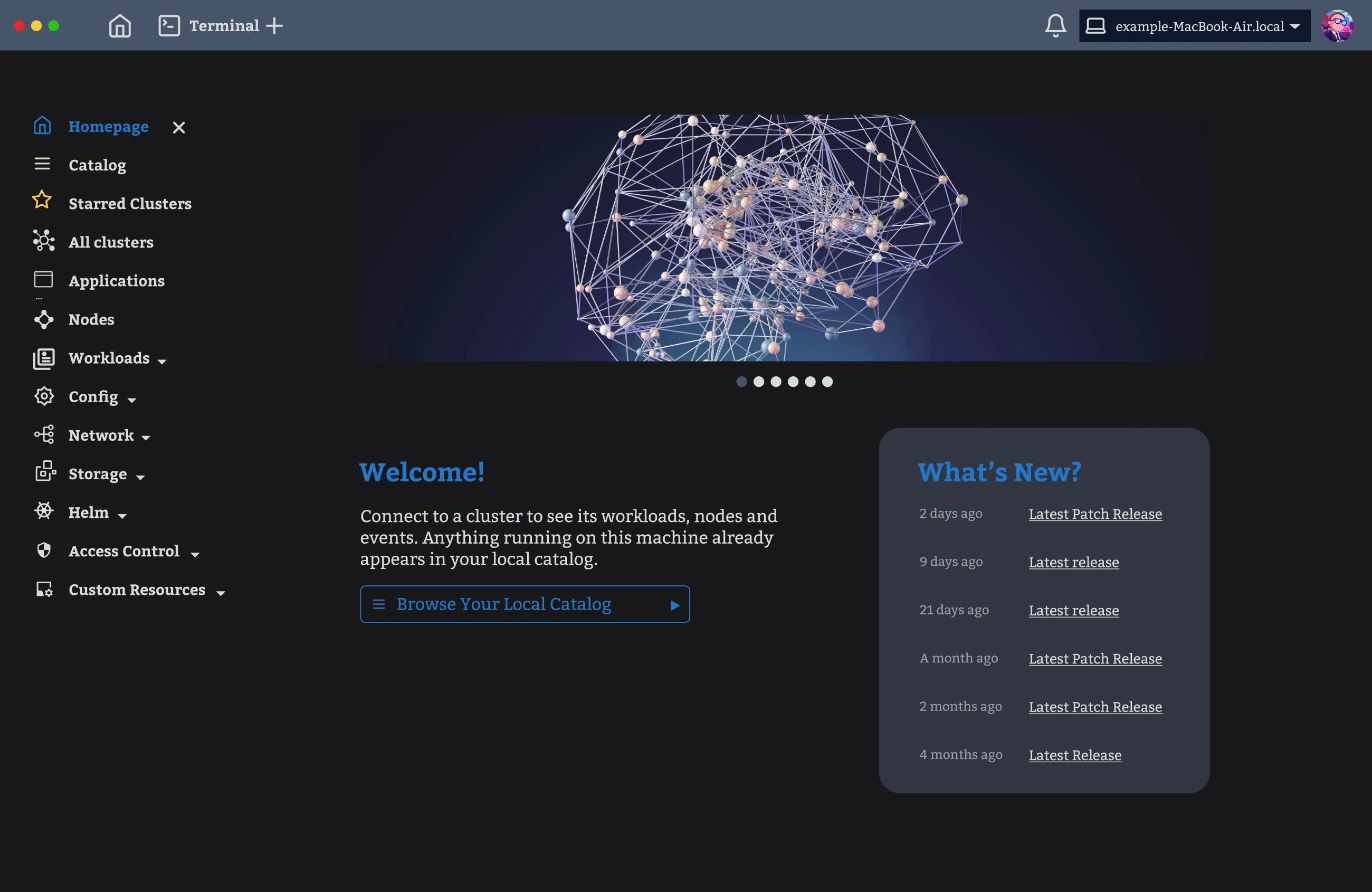
The left column was doing two jobs at once. The column held a list of saved clusters, and it held the tree of resources inside whichever cluster was open. Because both jobs sat in one container, an objection to the saved clusters read as an objection to the tree, and my next draft removed the whole column.
Separating the two jobs is what settled where each belonged. I moved the full list of clusters into the catalogue, where a cluster is starred once and found again by name. The starred few stayed in the column for the return trip.
The resource tree stayed on the left, because a list that deep needs vertical room and a horizontal bar cannot give it. I gave the tree a collapsed state rather than a fixed width. Gmail does the same with its label list, which folds to icons and hands the width back to the mail, so the pattern arrives familiar rather than novel.
Everything the top menu bar reached, the tree could reach on demand, so the menus came out. A narrow strip stayed across the top for the terminal, notifications and the machine being watched.
The terminal leaves the window
Established practice docks a terminal along the bottom of the cluster window, which works for a command and its answer. Reading logs as they arrive is different work, sustained rather than brief, and it wants width more than any other task in the product.
The question was therefore where the terminal should go instead. I moved the terminal into a window of its own, so the output gets width instead of the depth of a docked strip. Several sessions sit as tabs, which means a second terminal costs a tab rather than a second layout. The resource tree stays visible alongside, so leaving the logs does not mean navigating back.
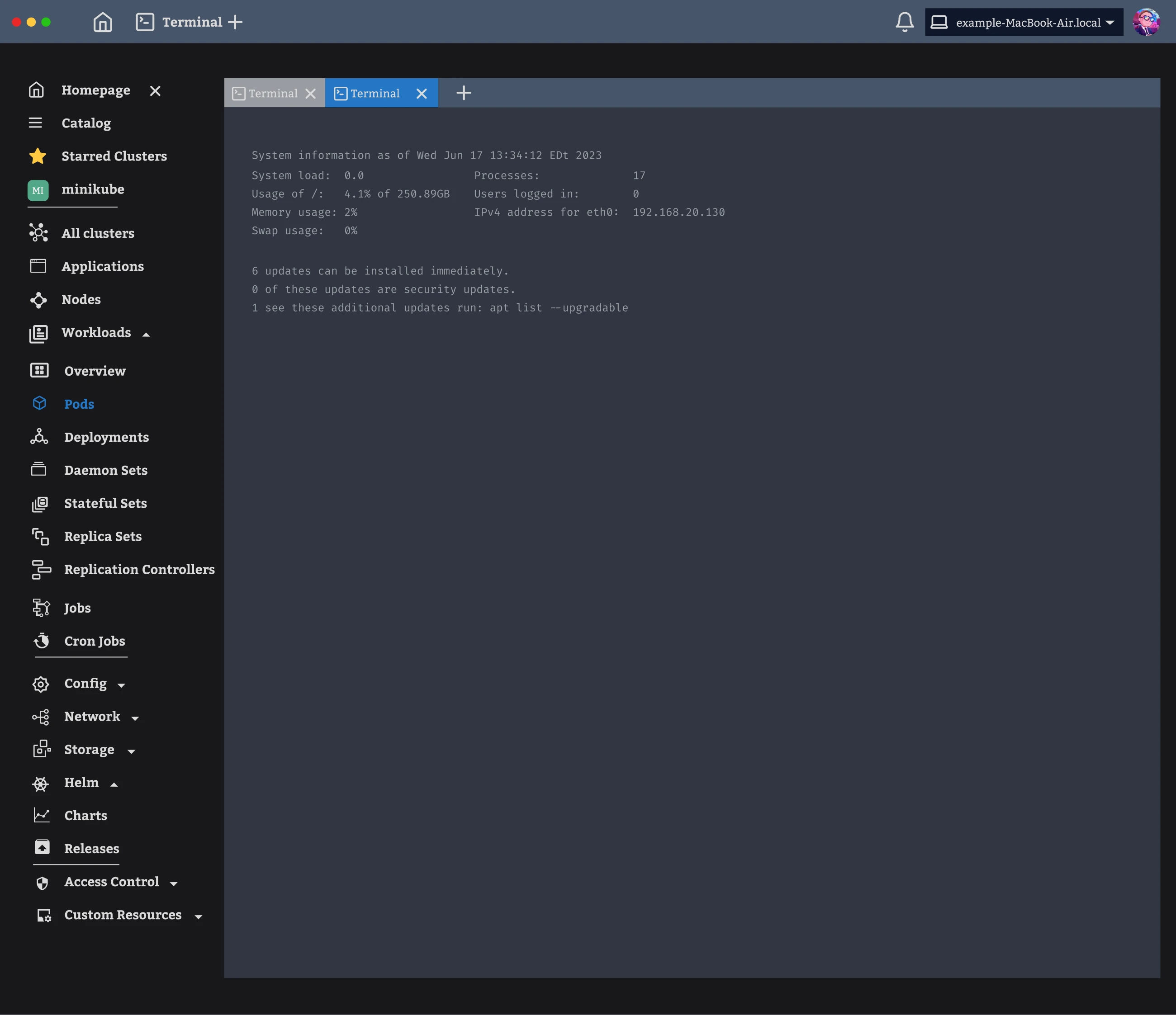
One rule governs the product. The interface keeps a single column, that column reaches everything, and it disappears on request.
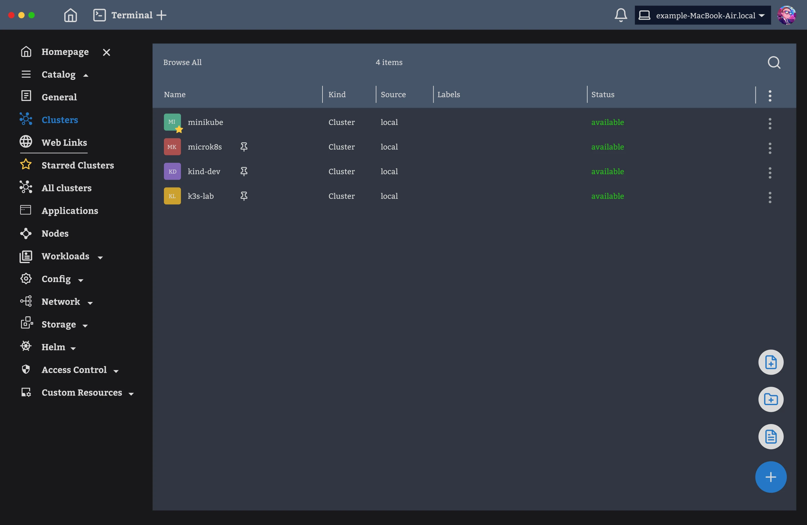
An operator opens the application with several clusters available and one that matters today. The reference tools met that situation with a standing rail of every saved cluster down the side, which costs width on every screen whether or not anyone switches.
The catalogue holds the full list instead, with each cluster listed by name, kind, source and whether it is available. A starred cluster shows the star in place of the pin offered to the others, so the two states never appear together. The controls for adding a cluster stay folded behind a single button until it is hovered.
The first question anyone asks on opening a cluster is whether something has broken. In the tools I read, the answer sat distributed across tables and had to be assembled. I gave that answer the largest panel on the screen, and the panel says in plain words when the cluster is healthy. The measurements sit above the panel rather than replacing it.
Everything deeper sits behind the tree rather than beside it. Each kind of resource gets the same table, and a search field labelled with whatever it searches. Moving between resources therefore means reading a new table rather than learning a new screen.
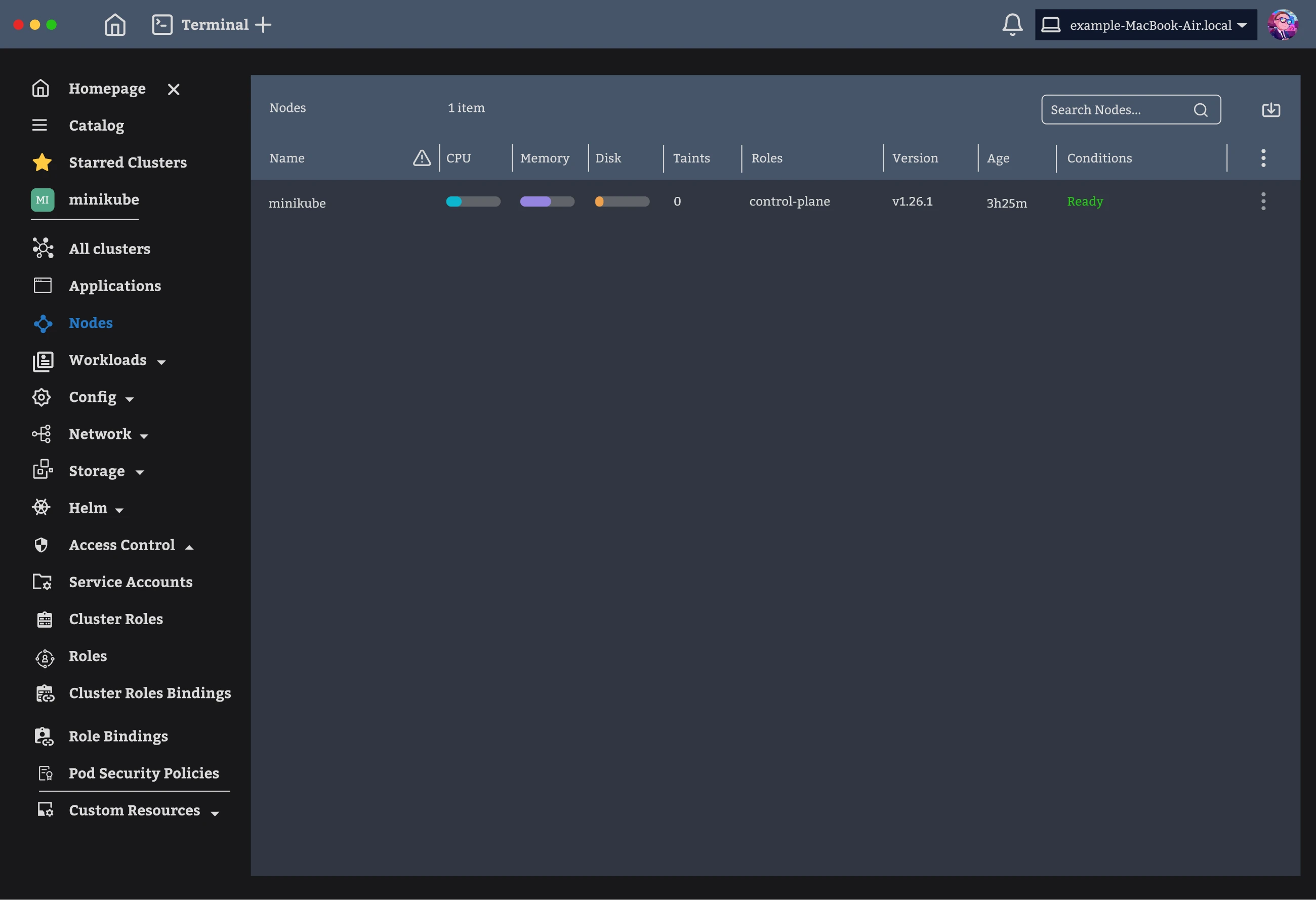
The collapse is what the whole design turns on. A tree of that size is right while someone is looking for a resource and wrong while they are reading one. I made the tree shrink to icons rather than fix one width and defend it.
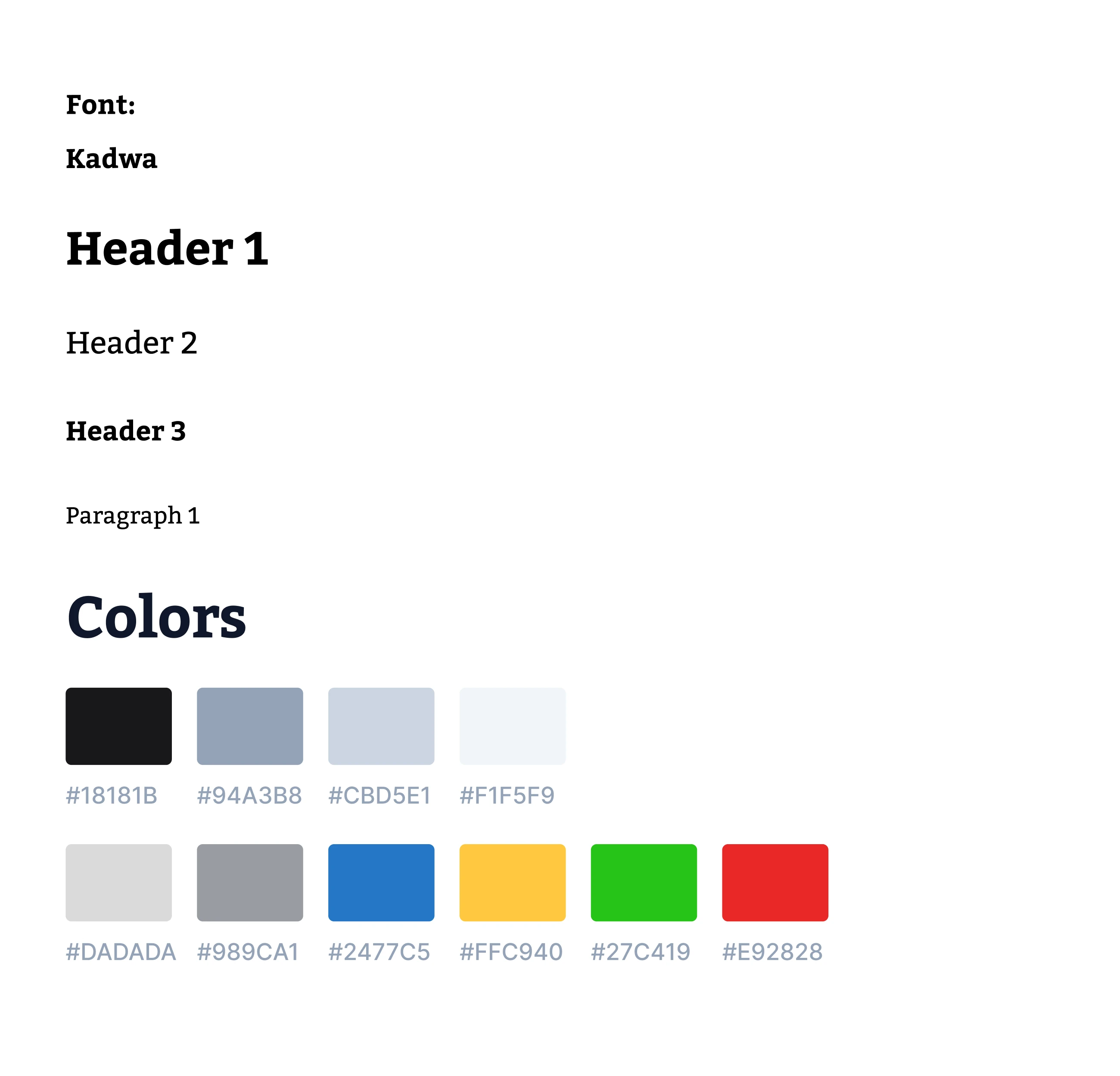
Colour does one job. I kept the interface in neutrals, so the four colours reserved for meaning arrive against a quiet background: blue for the current selection, then amber, green and red for state. The charts carry their own set, kept apart from those four, so a measurement is never read as a state.
A prototype was included in the Figma file, since the collapse is the one behaviour a static screen cannot show.
The design was measured against published research and against the client’s daily experience of running clusters, rather than against user interviews. Three things came out of this project that I now carry into any tool built for watching a system.
On a monitoring tool, the interface competes with the thing being monitored
Navigation is permanent, while the reason someone opened the application is specific and brief. The tempting response is to make the navigation narrower. The better response is to make it removable, because the right width for finding a resource is not the right width for reading one. Both widths are correct, at different moments.
A current value is not an answer without a direction
Octant showed processor and memory as figures alone, so an operator could read the current value and not the direction it was moving in. Direction is what the question is usually about. Usage therefore arrives as a filled bar in the tables and as a chart across a period on the cluster view. The figures sit beside the chart, not instead of it.
An argument about a component is usually an argument about frequency
The objection to the left column sounded like an objection to a component. The point underneath it was a work pattern, since someone watching one cluster for an hour has no use for a standing list of the others. Restating the argument in terms of how often something happens changed the question. The question stopped being whether the column should exist and became which of its two jobs belonged there.
More projects